Name
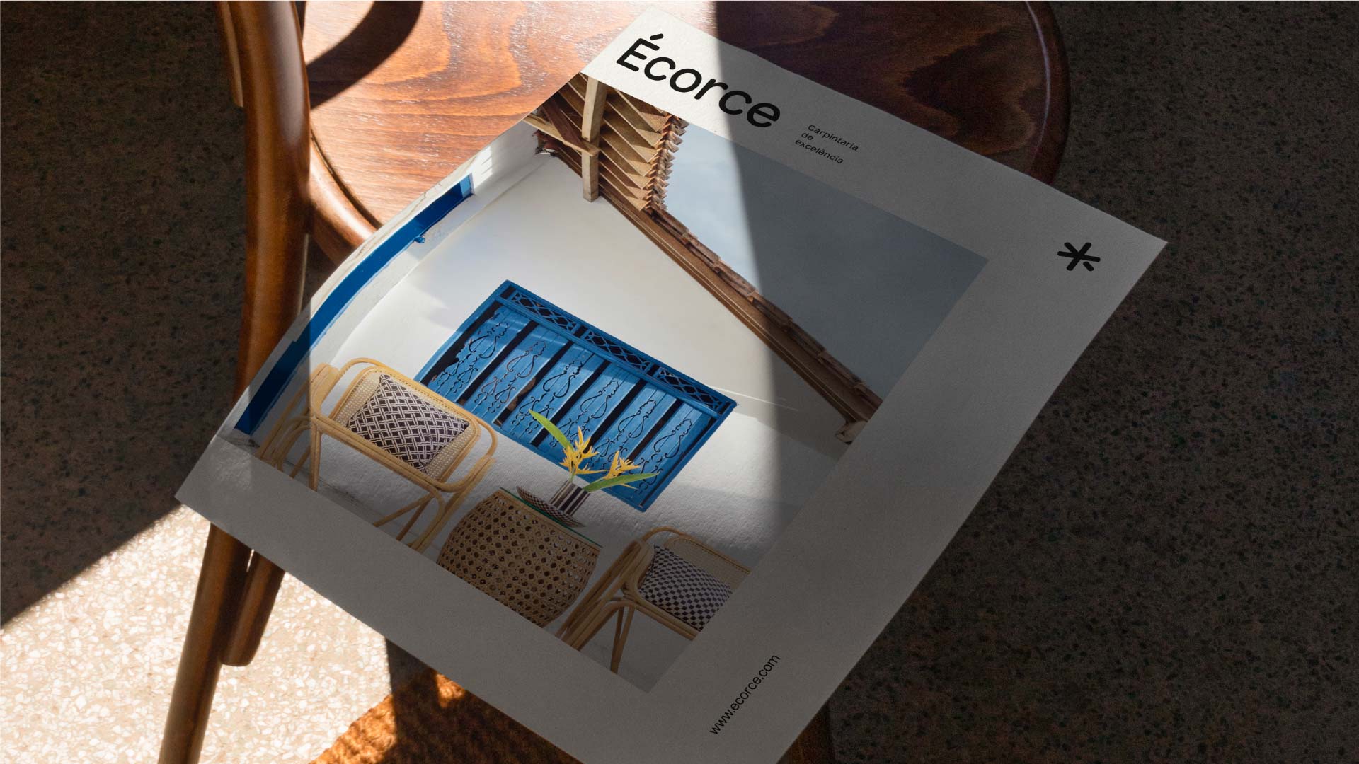
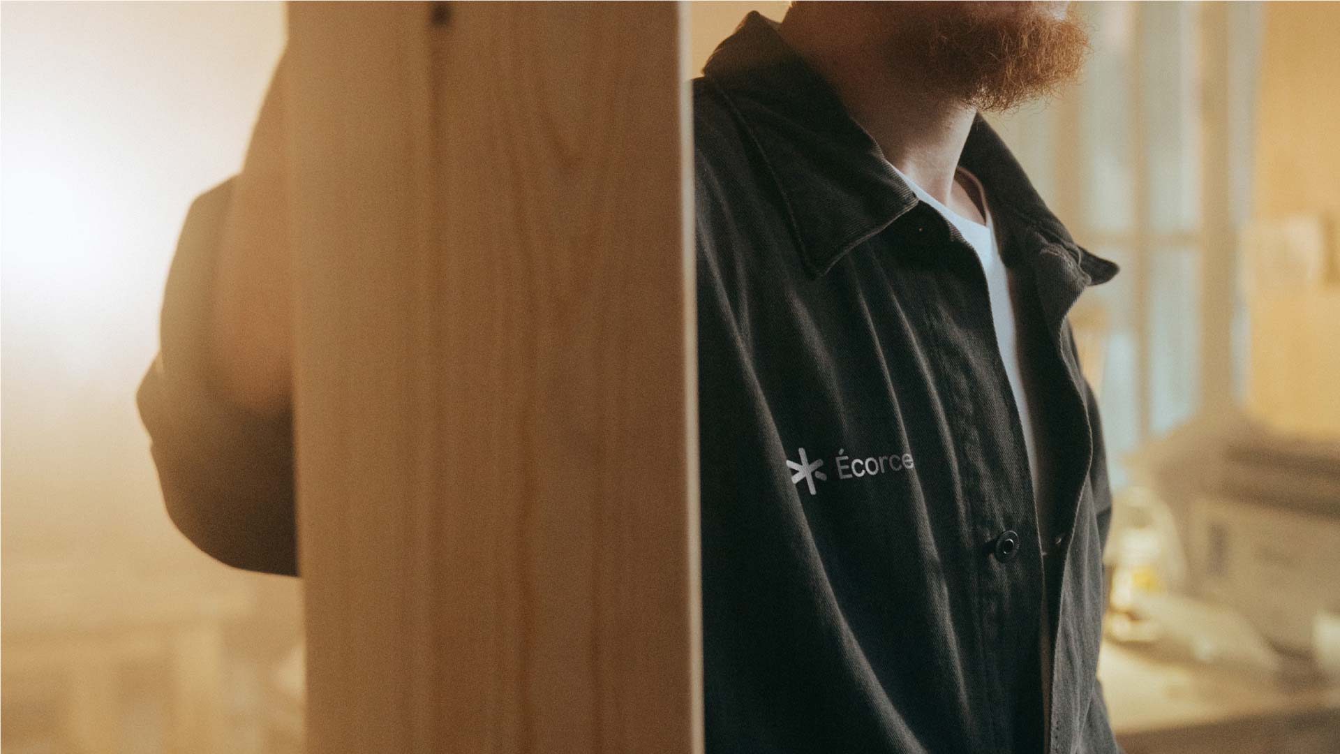
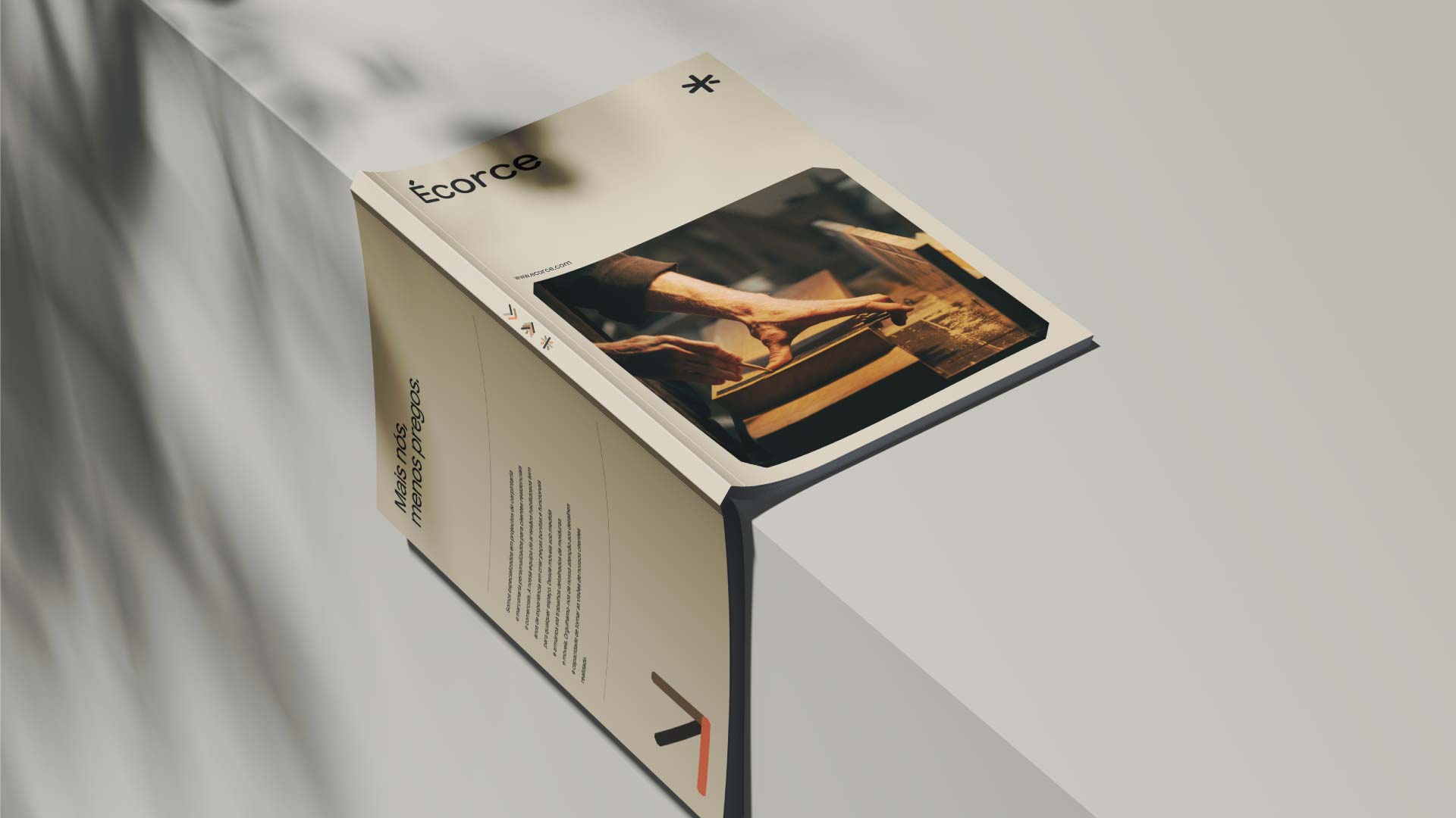
Écorce
Year
2023
Client
Écorce
Scope
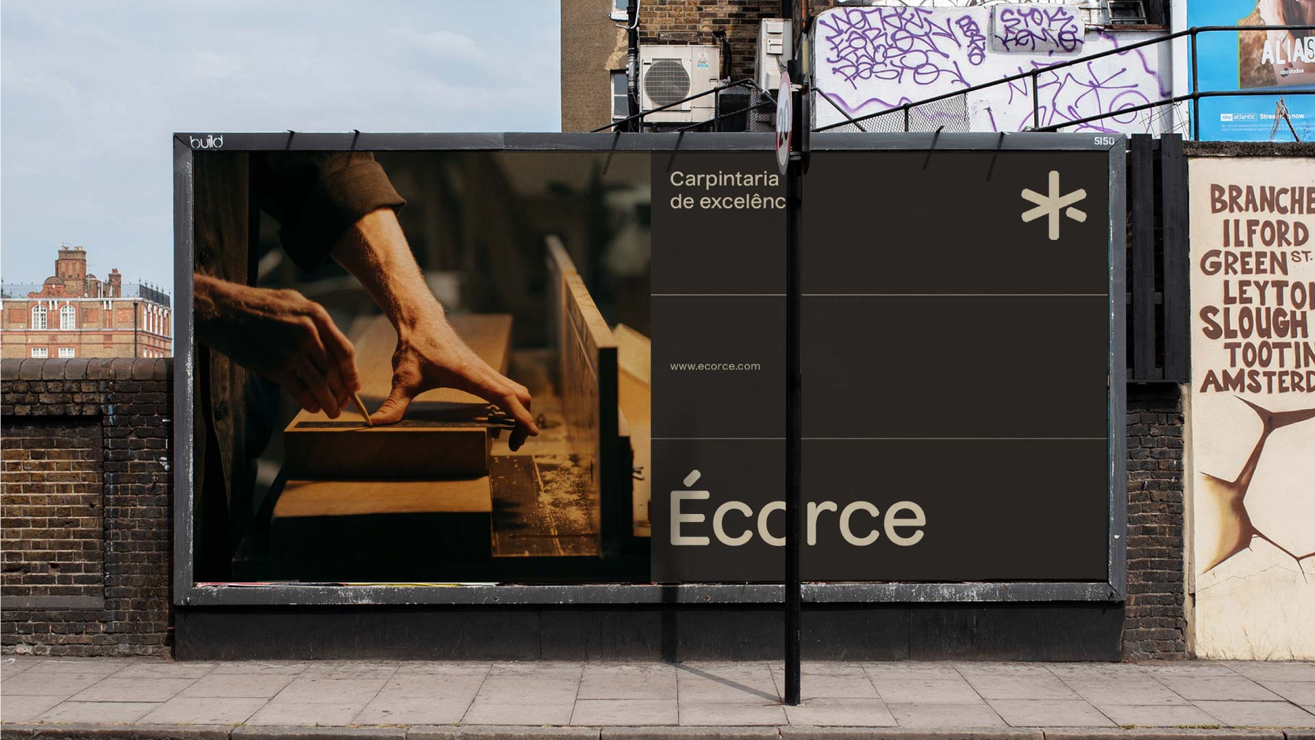
Branding
Description
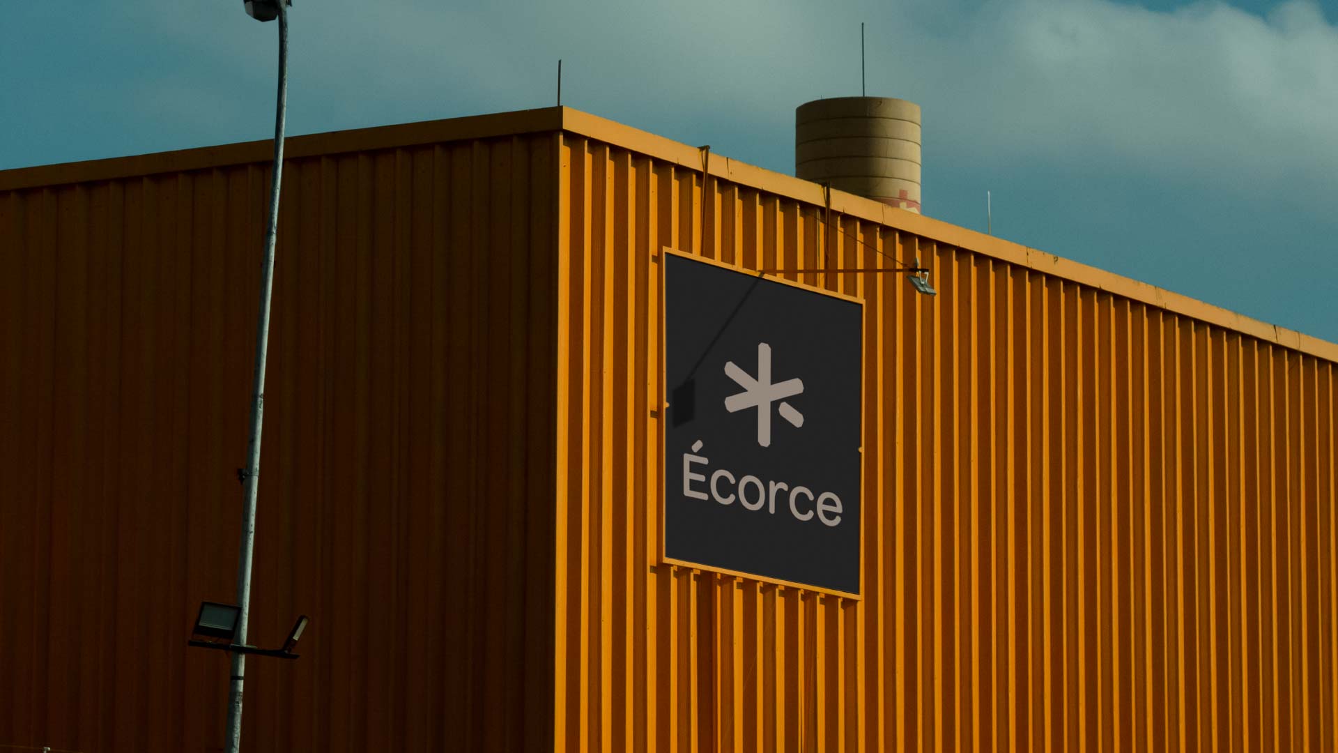
Based in the industrial section of Laúndos, within the picturesque Póvoa de Varzim region, Écorce seamlessly transformed a traditional and familiar carpentry into a modern co-working space. The essence of Écorce revolves around the fusion of two key elements: material and personal. On one hand, the team upholds an unwavering commitment to work only with highest quality materials, ensuring durability and longevity. On the other hand, they possess a deep-rooted passion, respect for materials, and invaluable experience gained over decades.
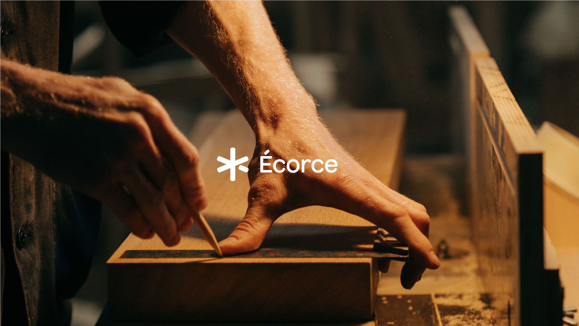
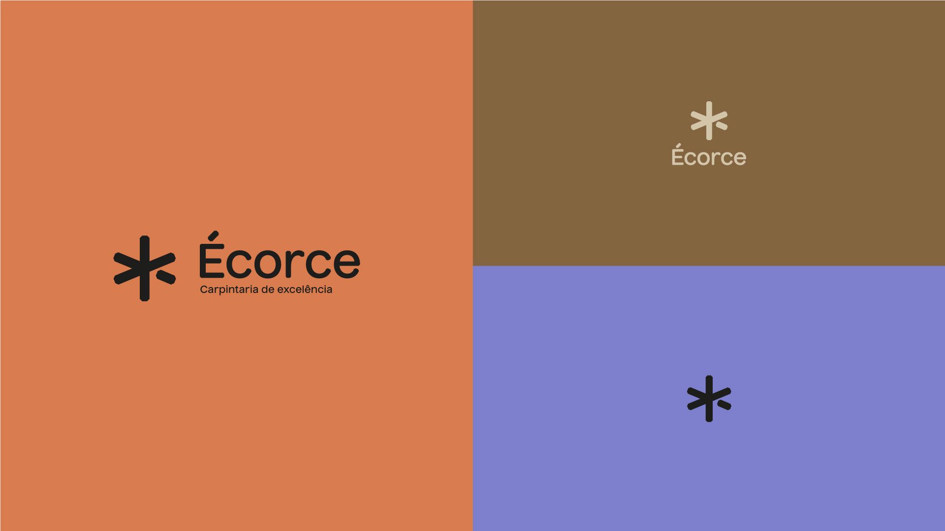

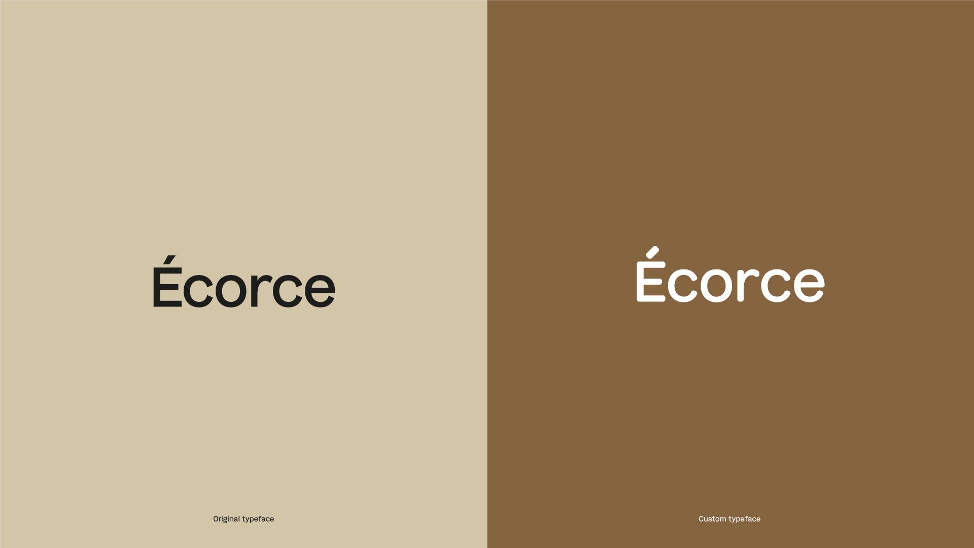
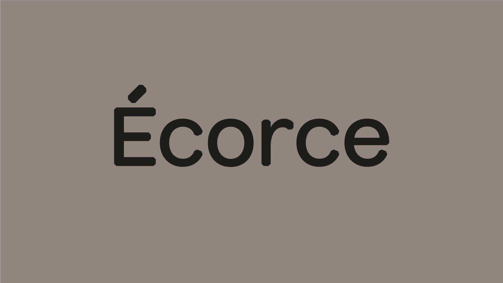
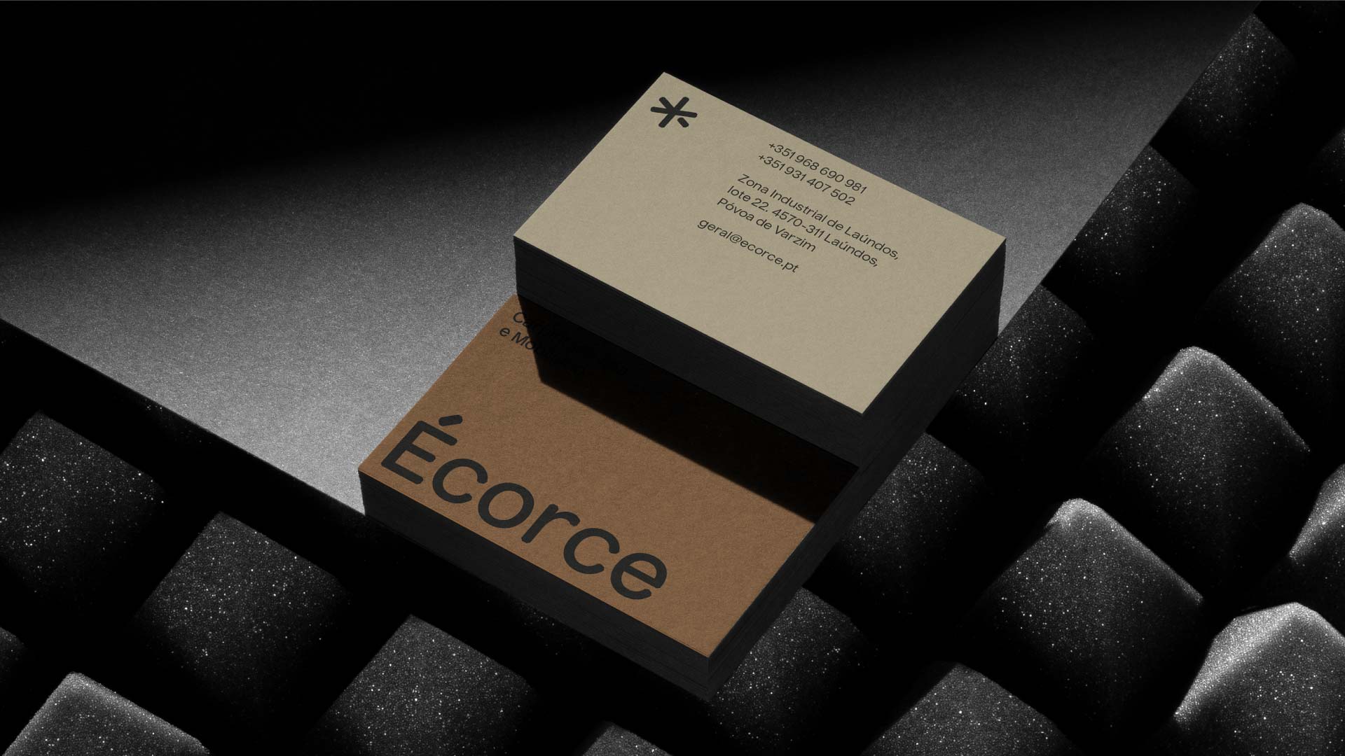
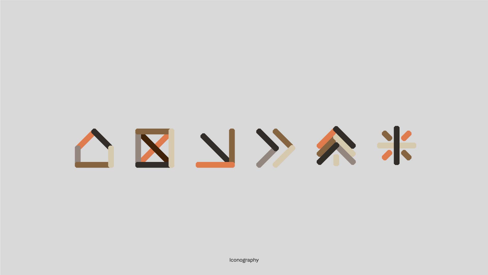
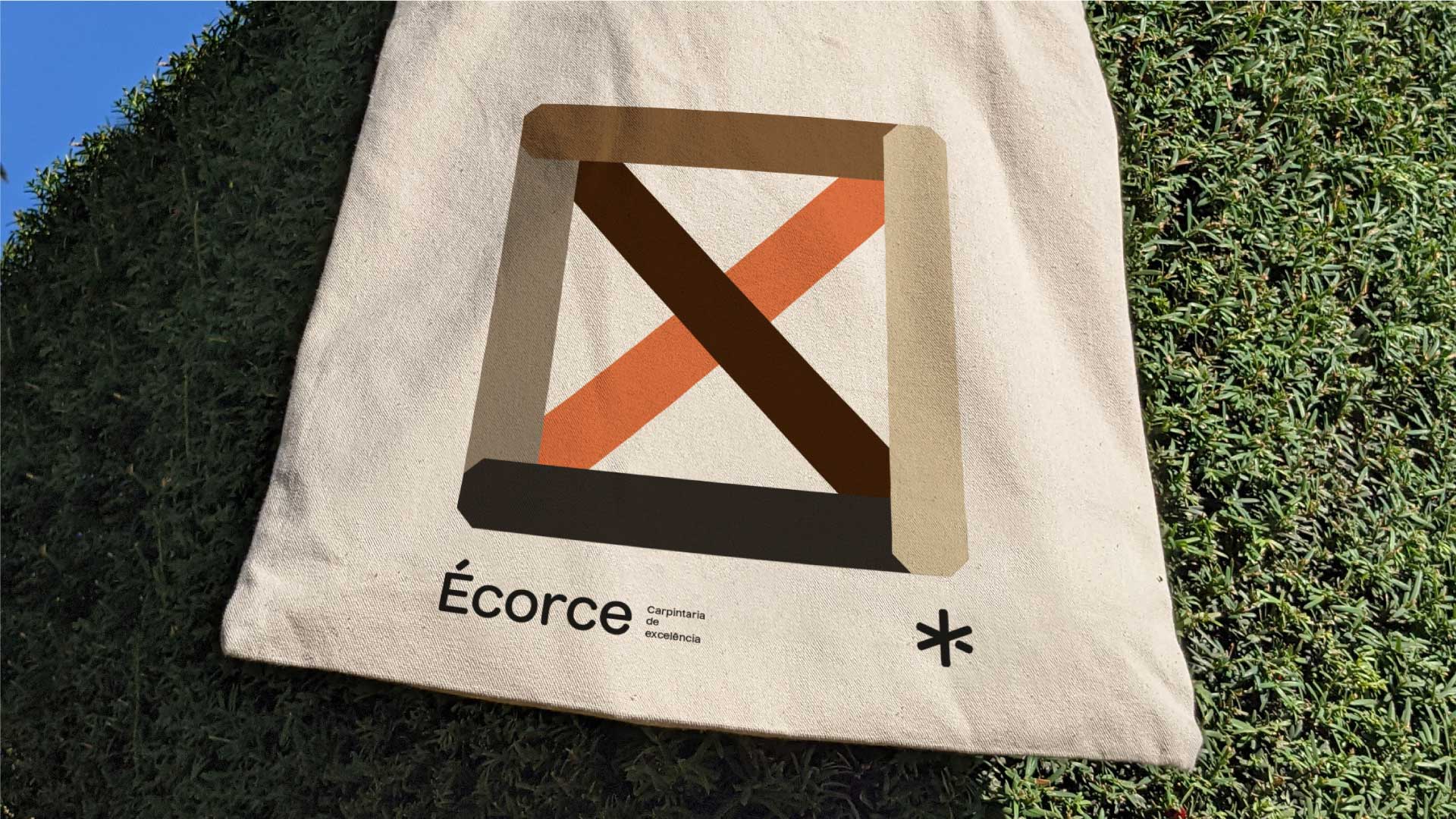
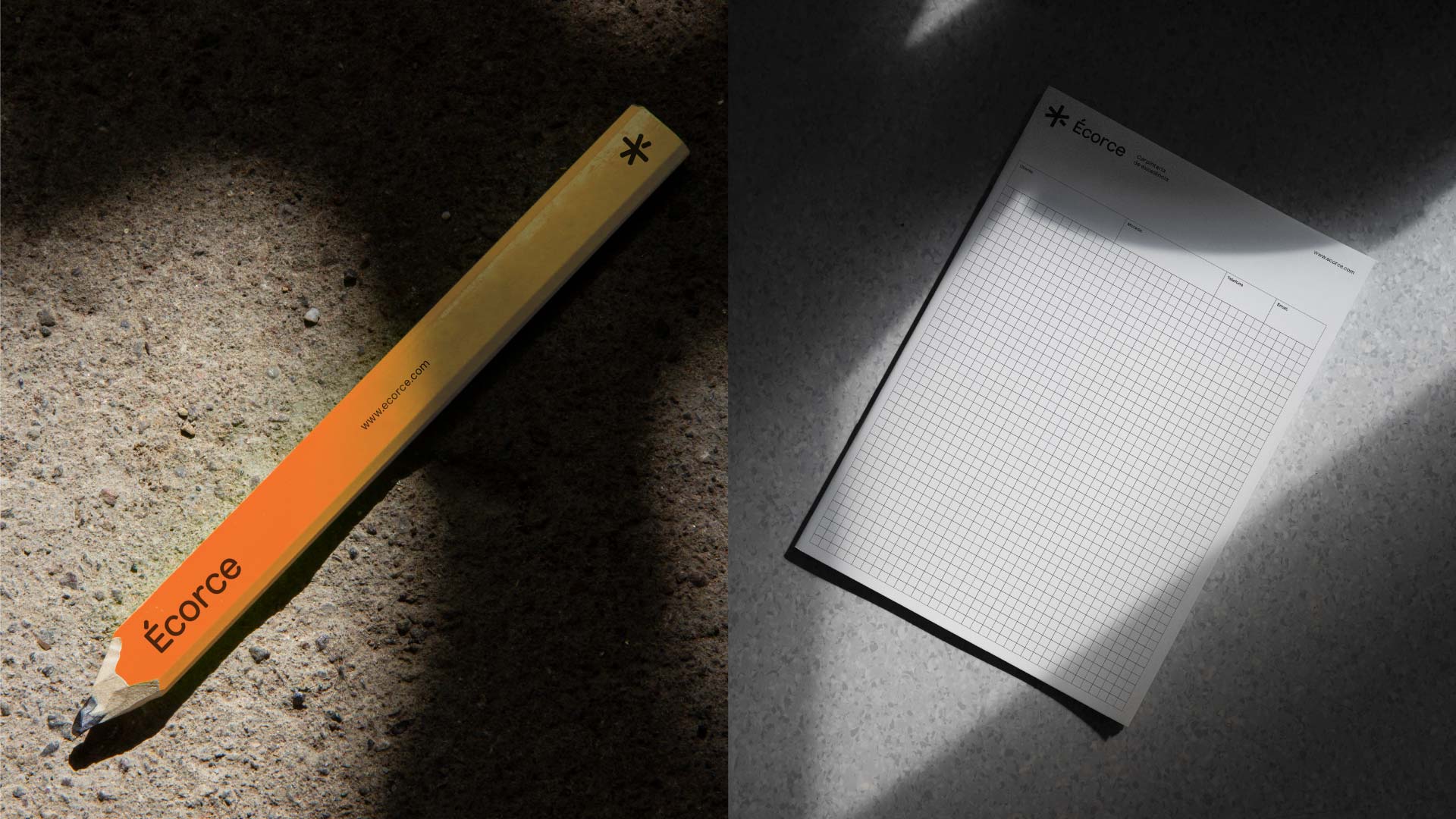
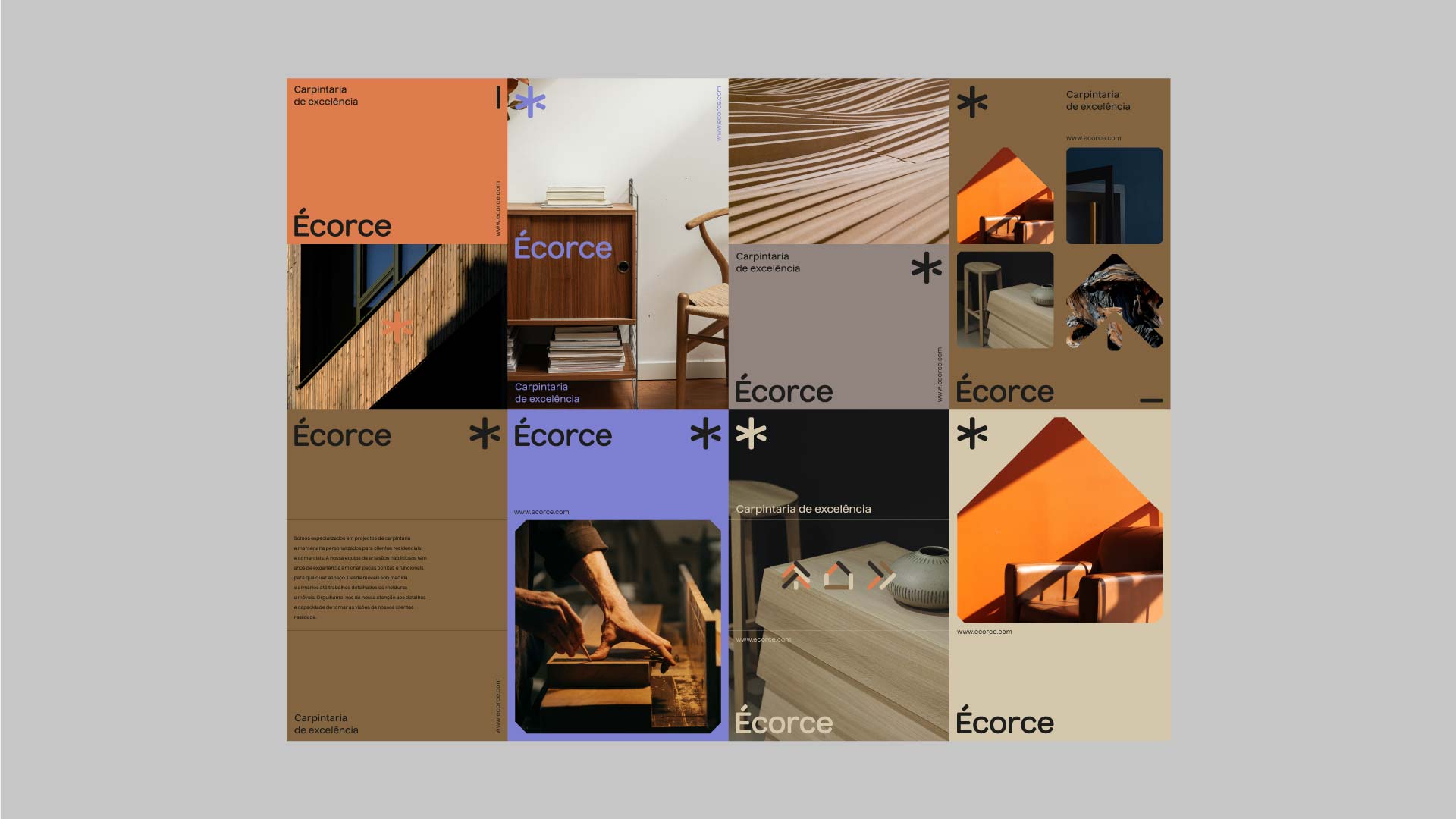
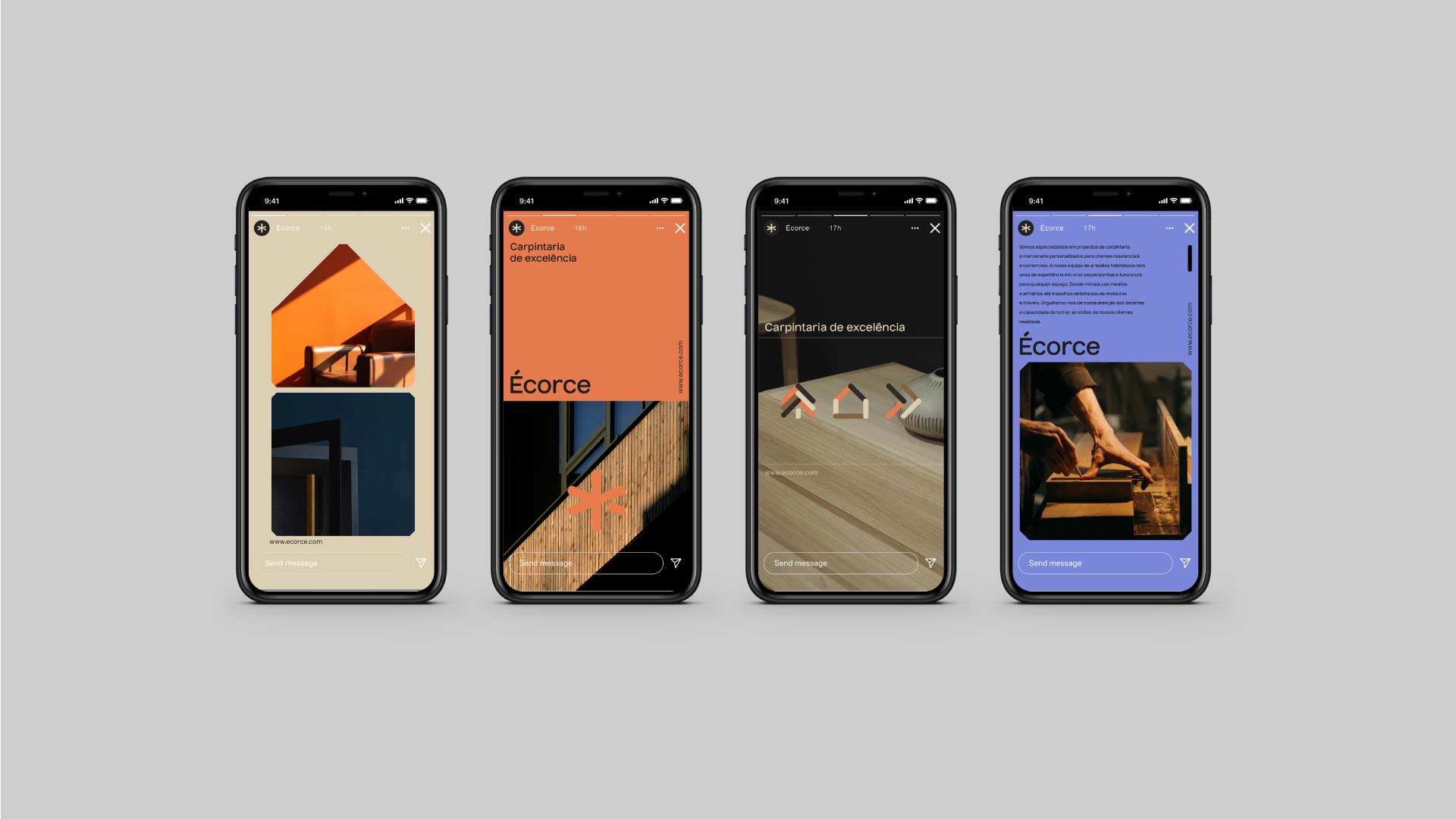
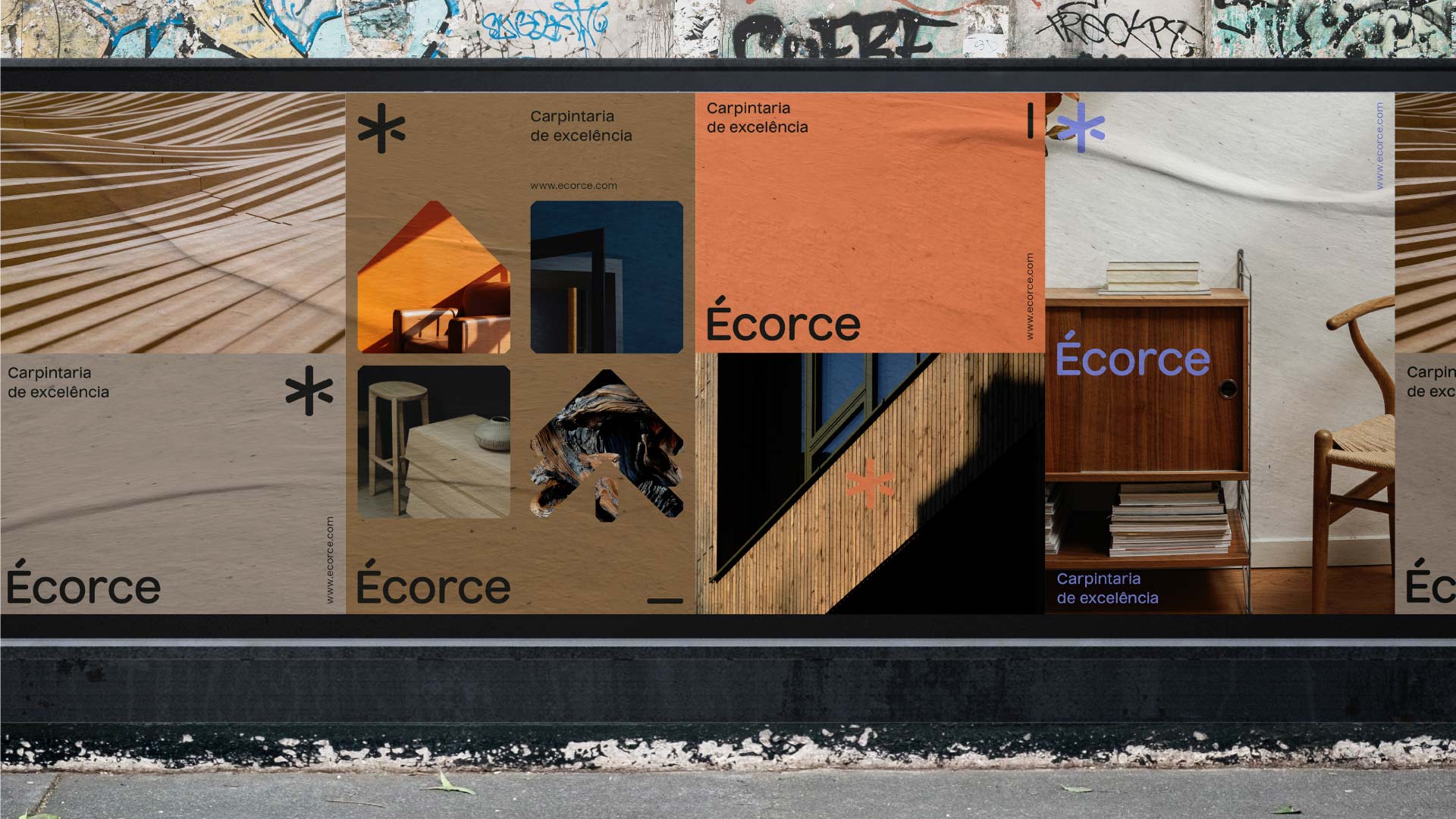
Their philosophy remains straightforward and we took it as inspiration: craftsmanship that eschews nails and glue in the construction process. For that reason, the logo draws inspiration from the intricate Japanese woodwork joints that, simultaneously, represents an 'E' letter and symbolizes the convergence of diverse ideas and the vision fostered within their co-working community. The logo and typeface carry small cuts along the edges, expressing the team's unwavering dedication to detail, aesthetics, and functionality. The color scheme takes the materials they work with as inspiration, blended colorful and strong colors, to apply bring modern accents, vibrancy and vitality into the brand.