Name
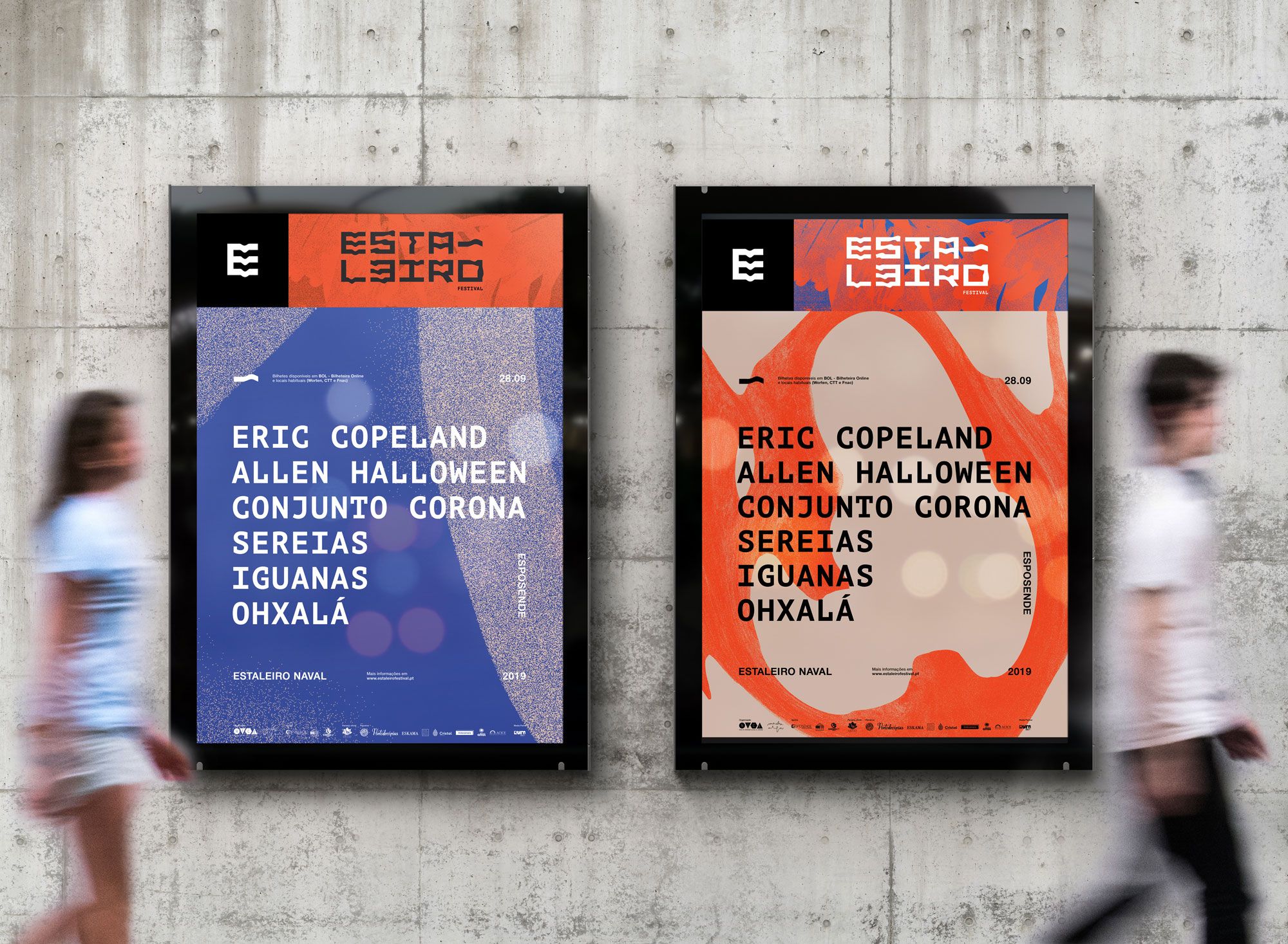
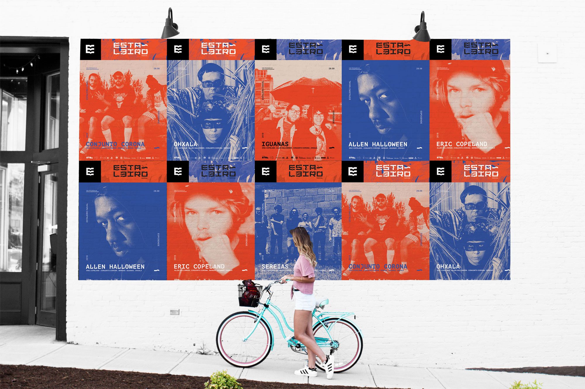
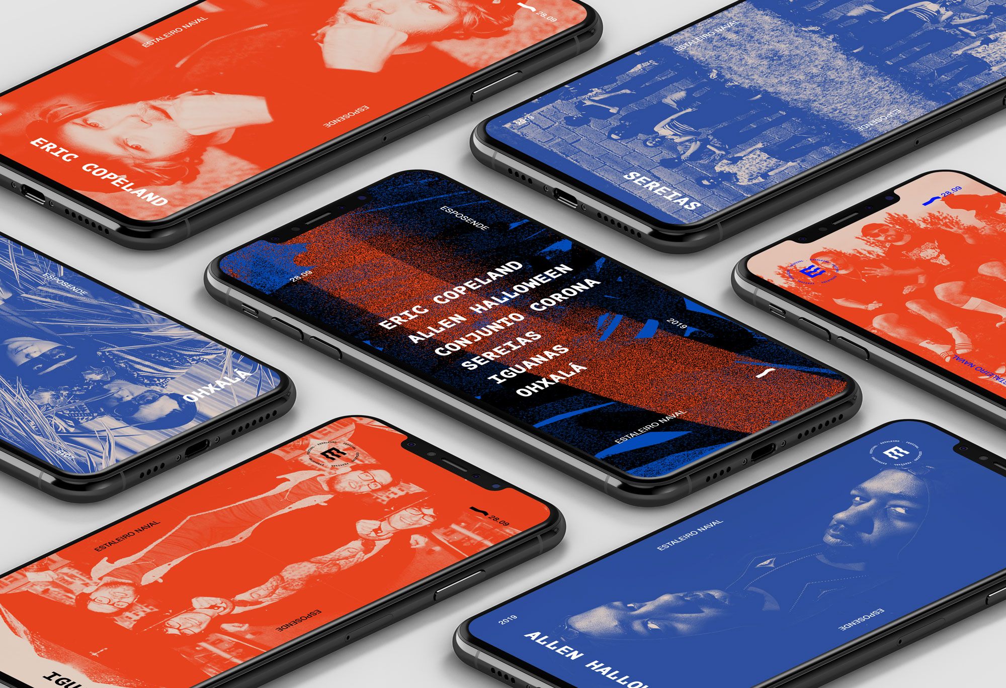
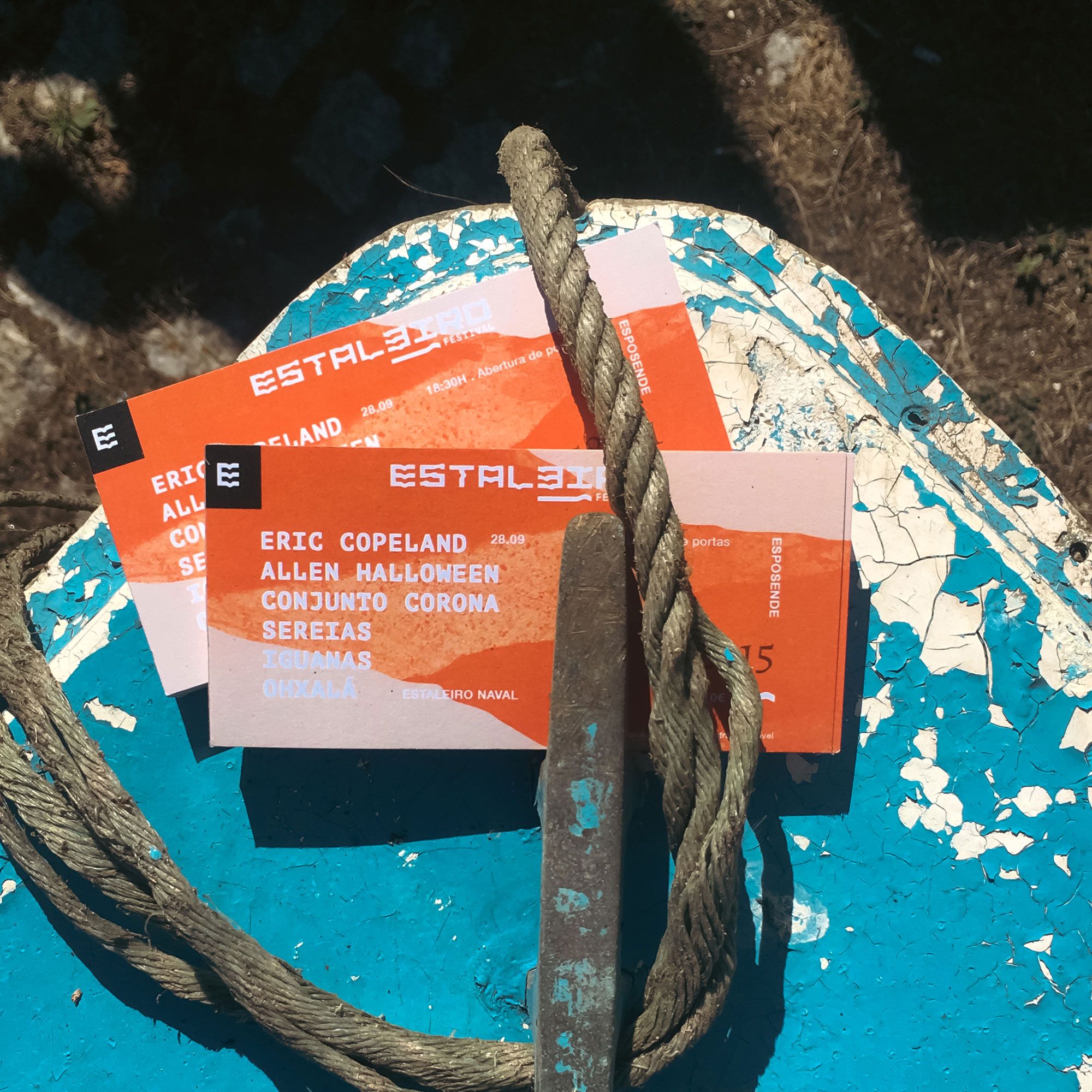
Estaleiro
Year
2019
Client
Nice; Macho Alfa
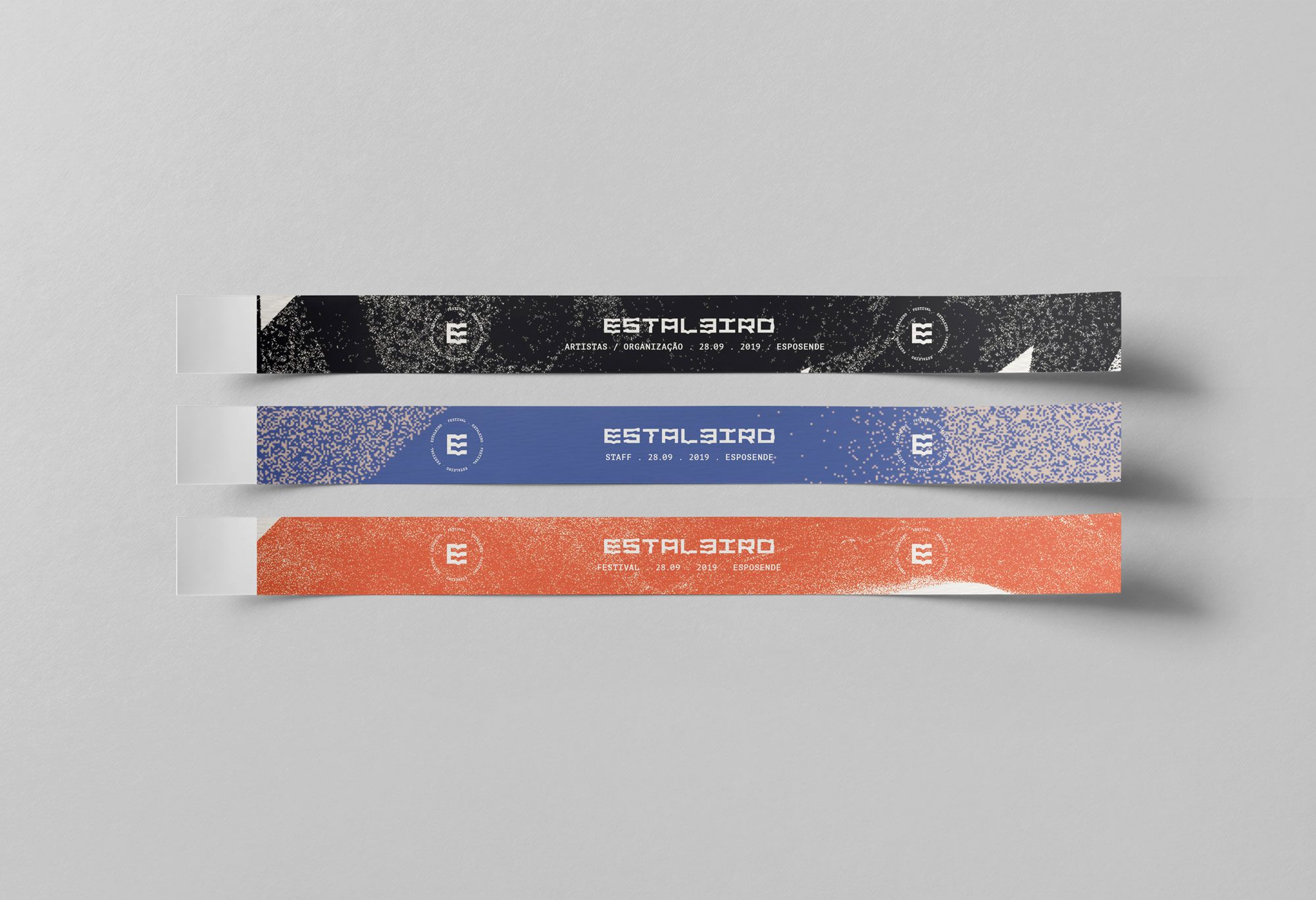
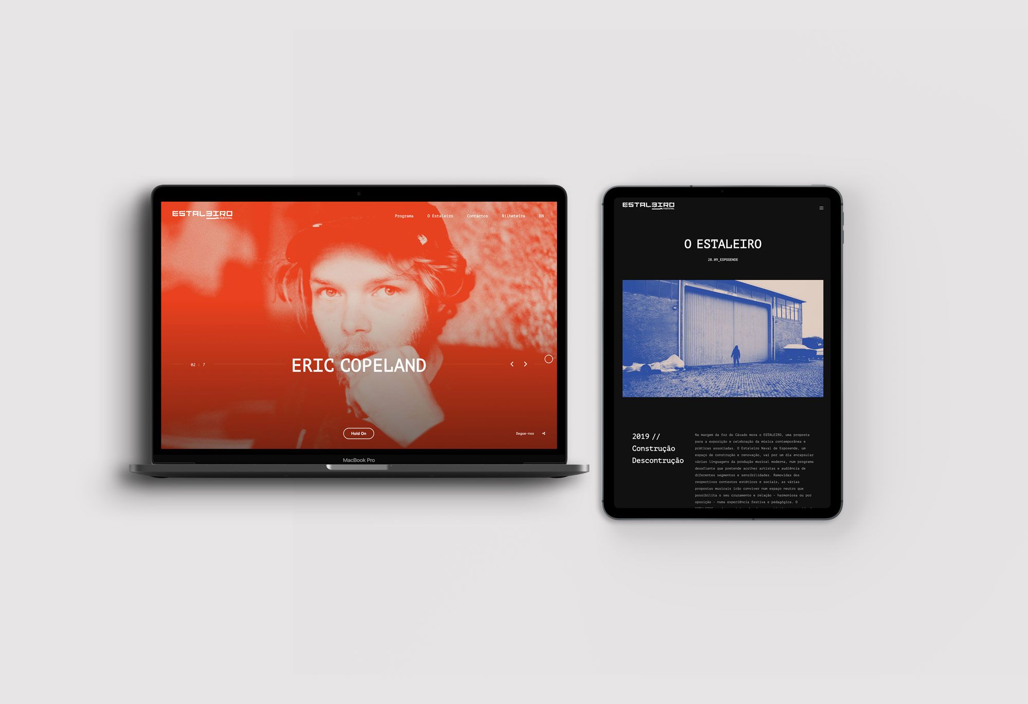
Scope
Branding . Poster
Description
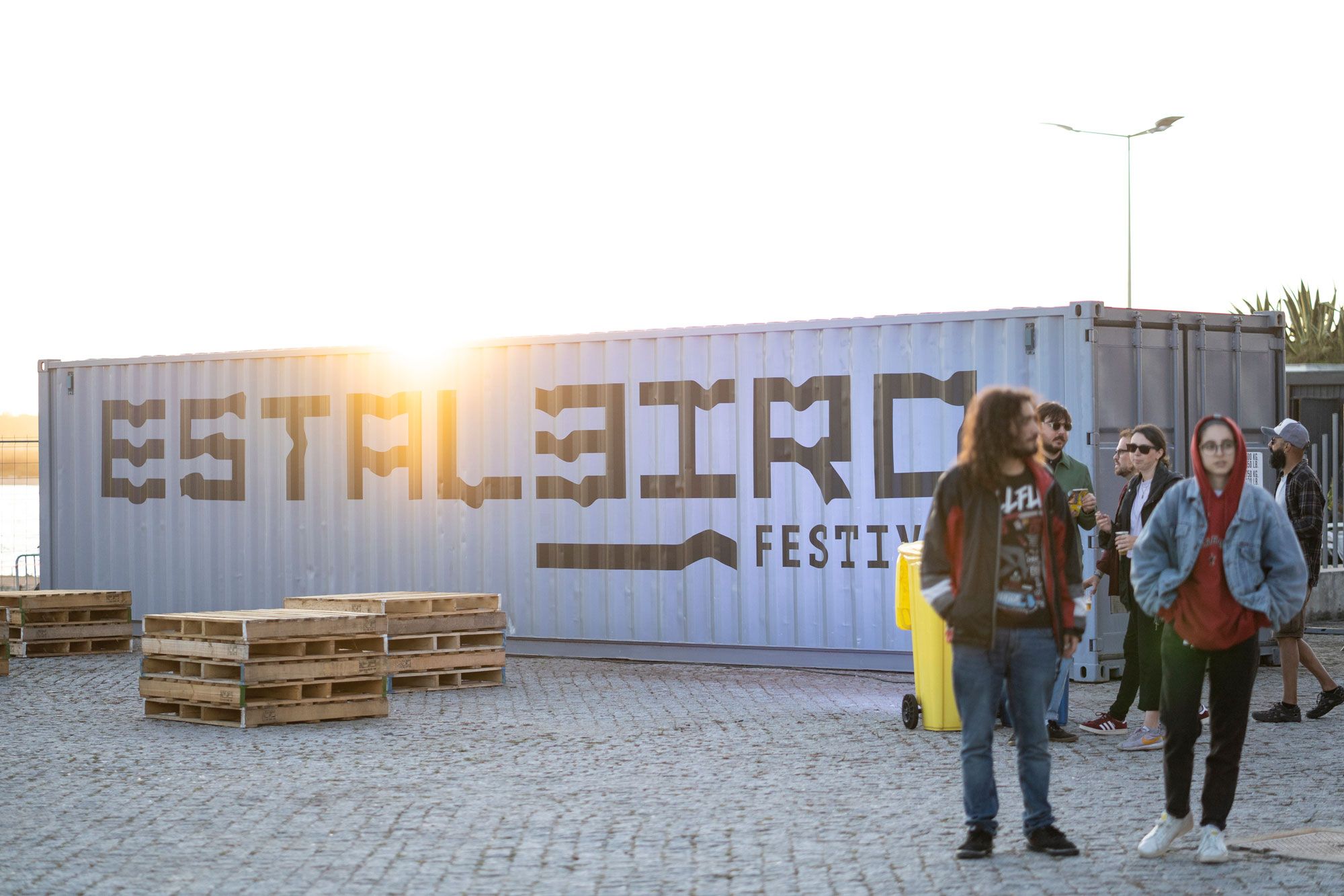
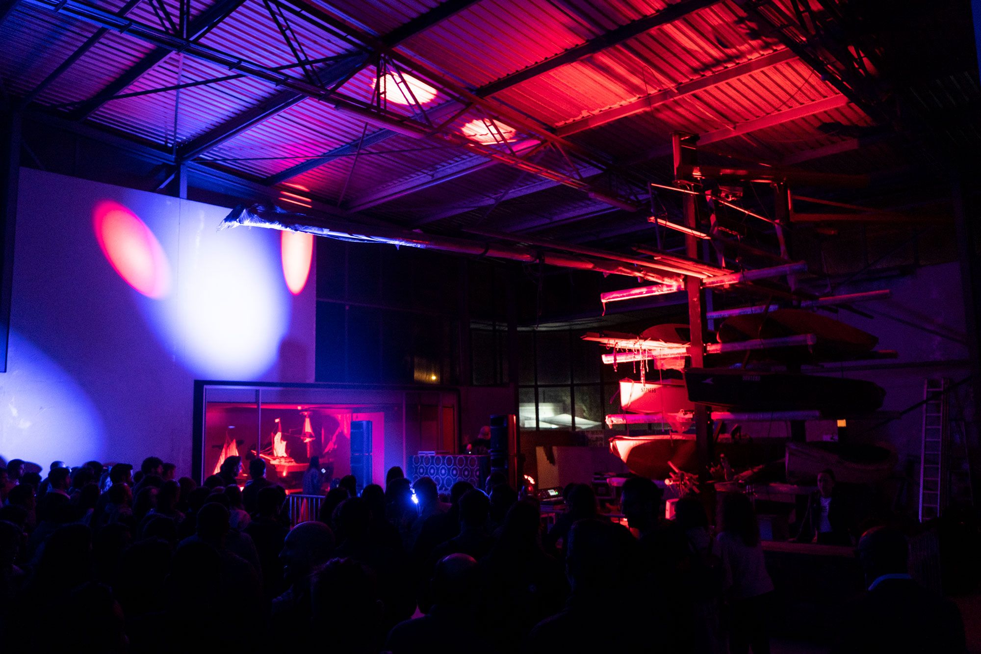
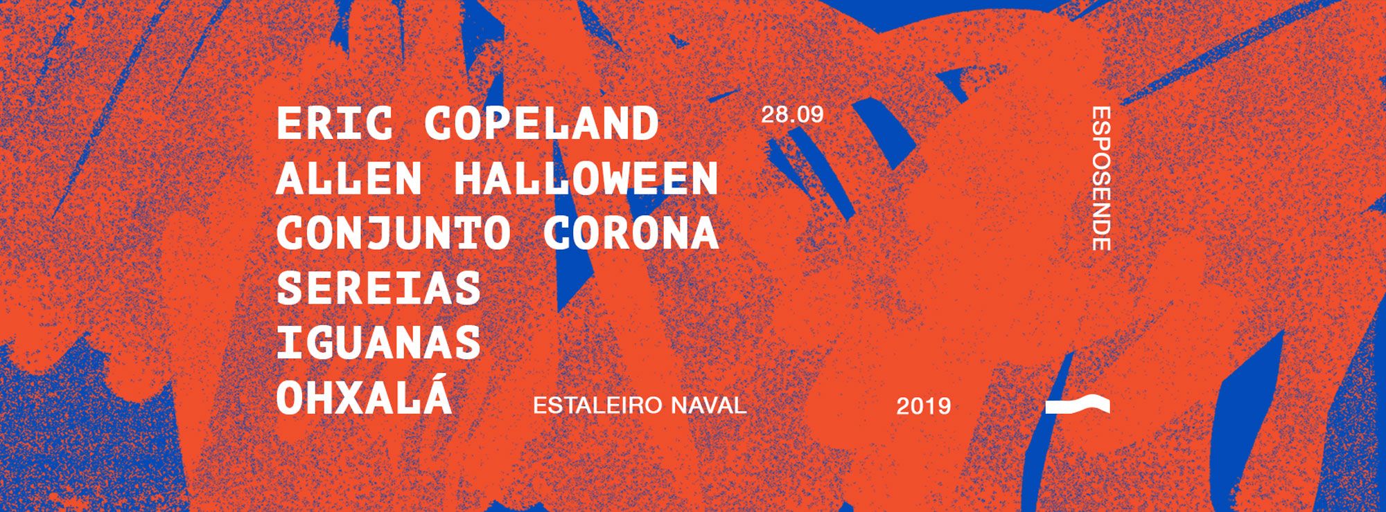
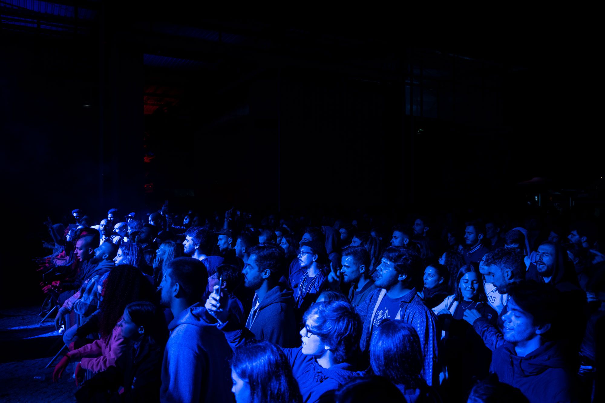
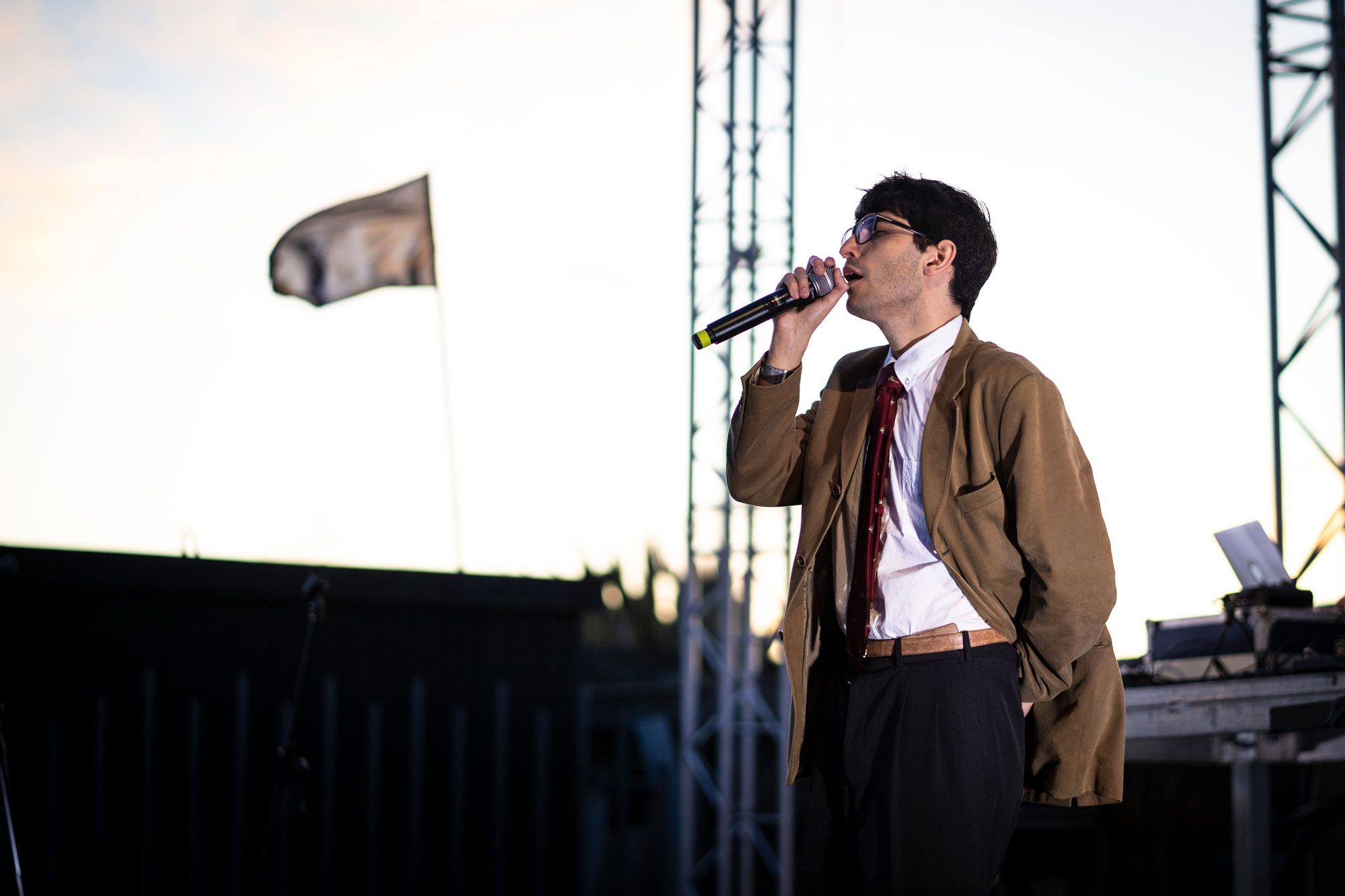
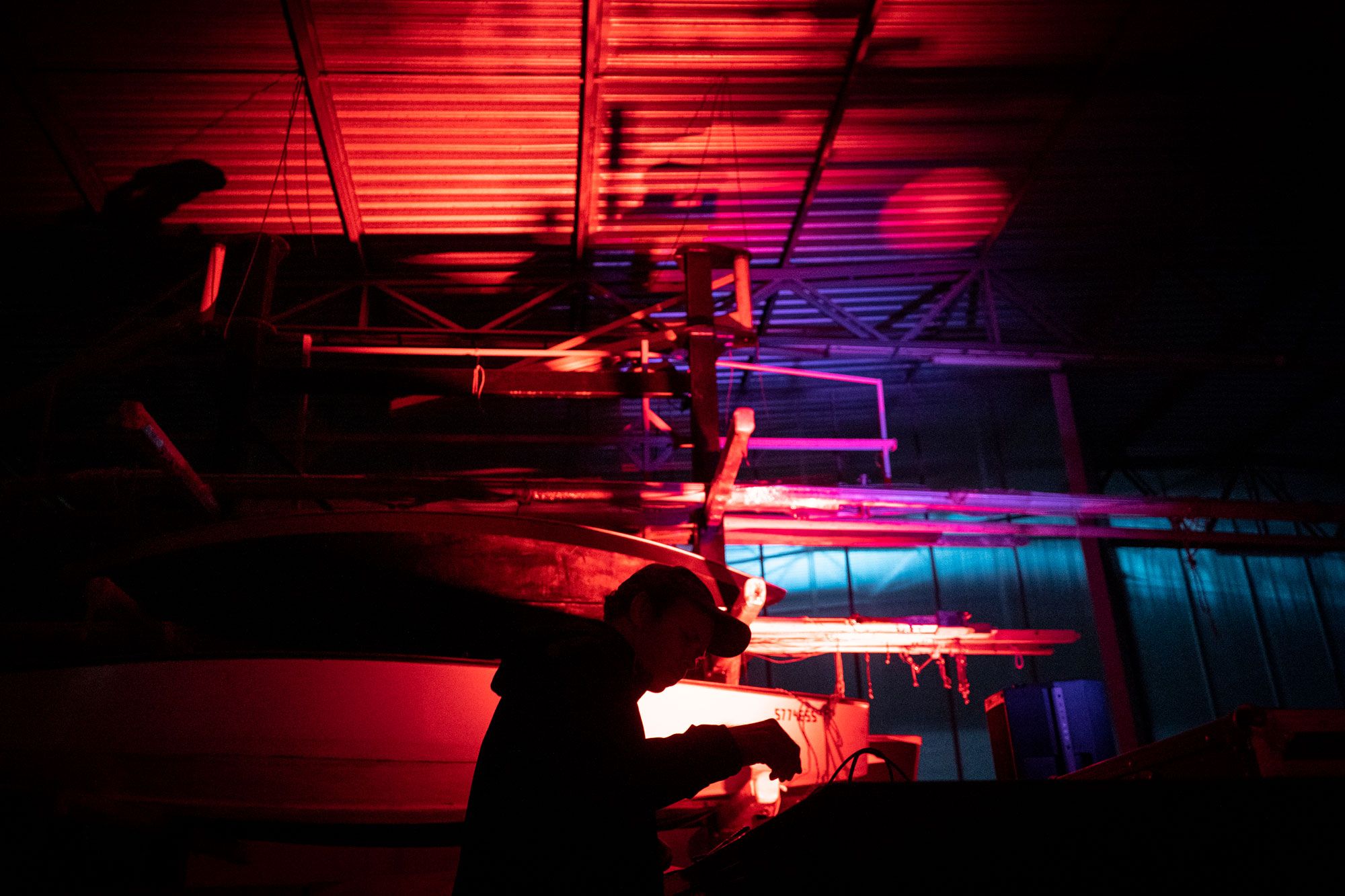
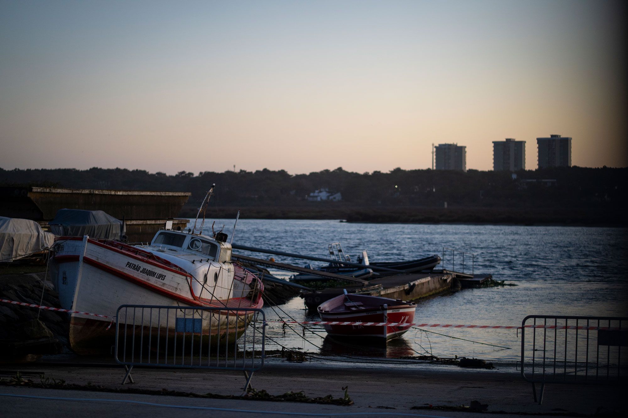
In September 2019, Esposende’s old shipyard hosted the first edition of Festival Estaleiro, organized by the cultural associations NICE (Esposende) and Macho Alfa (Barcelos). The headliners were American experimental musician and ex-member of Black Dice, Eric Copeland, and notorious Portuguese rapper, Allen Halloween, whose work has been distinguished for its uniqueness and boldness. Antecâmara Studio was in charge of the event’s materials and identity and used the experimental-industrial mood of the festival, as well as the ambience of the city and the site, as inspiration.
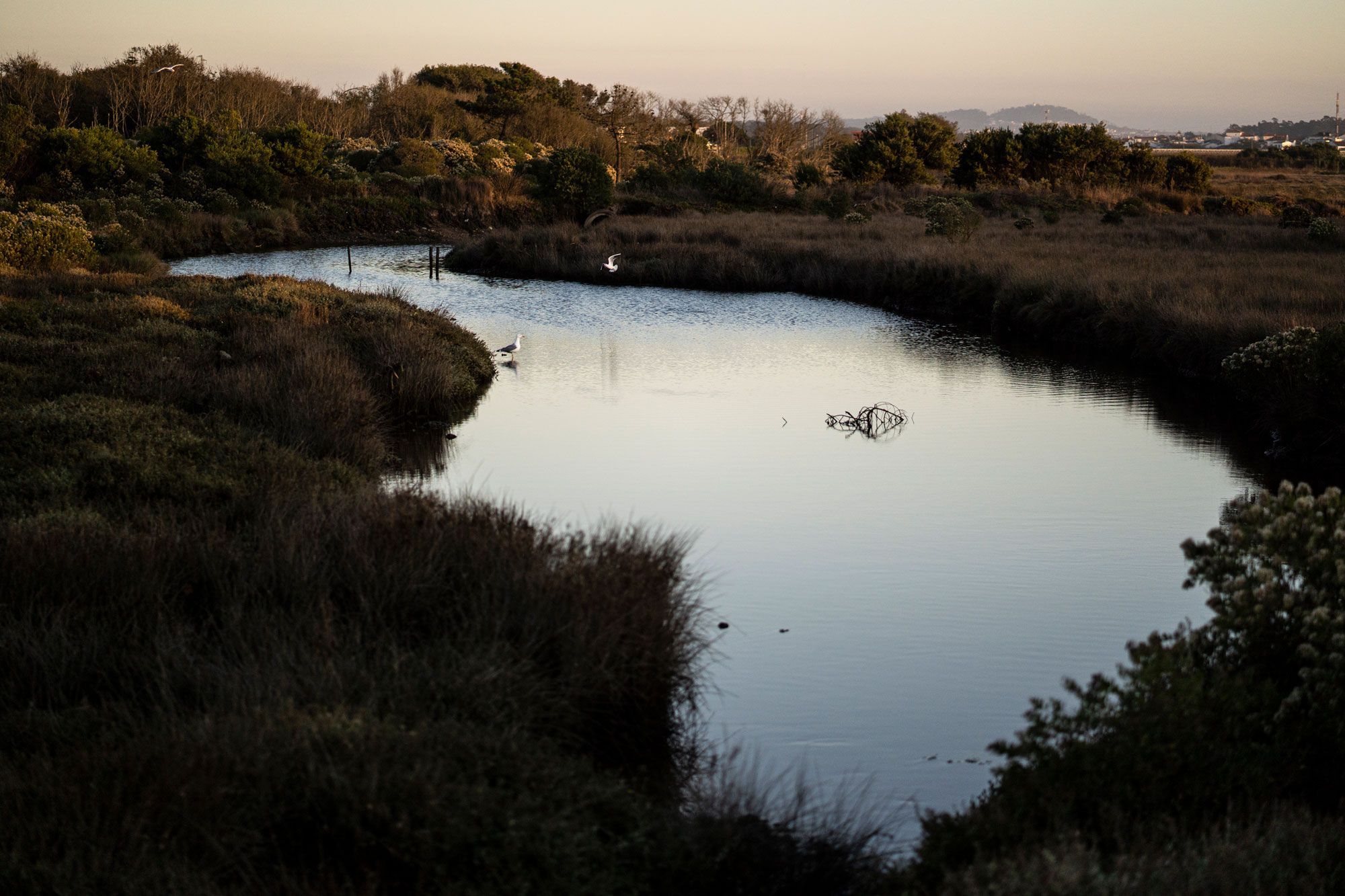
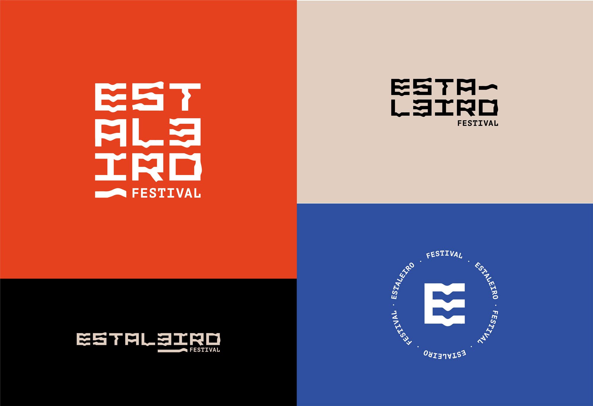
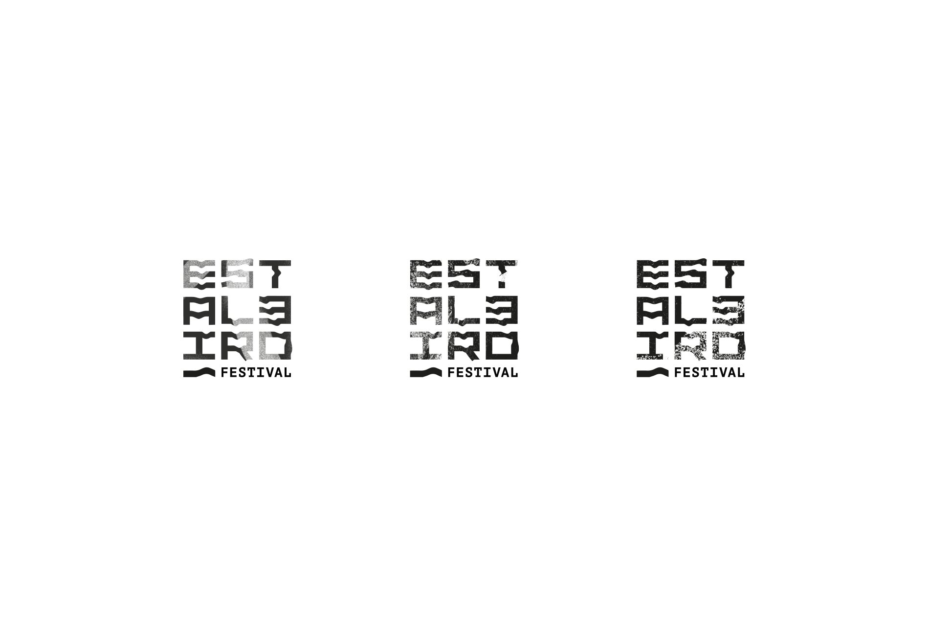
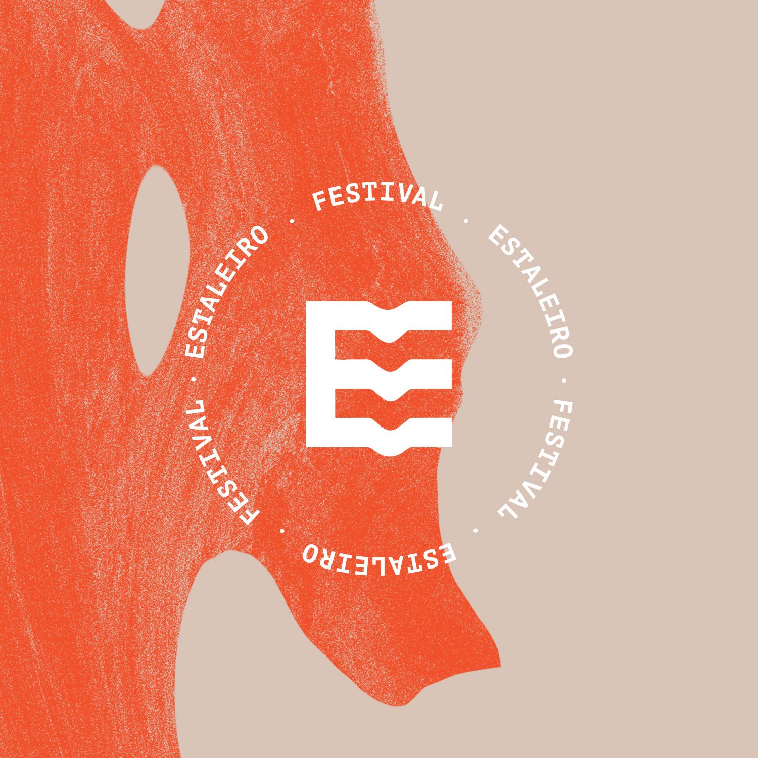
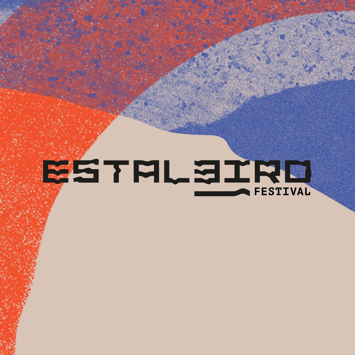
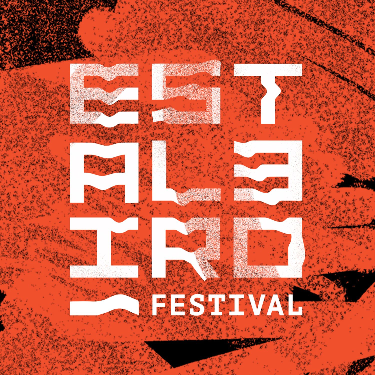
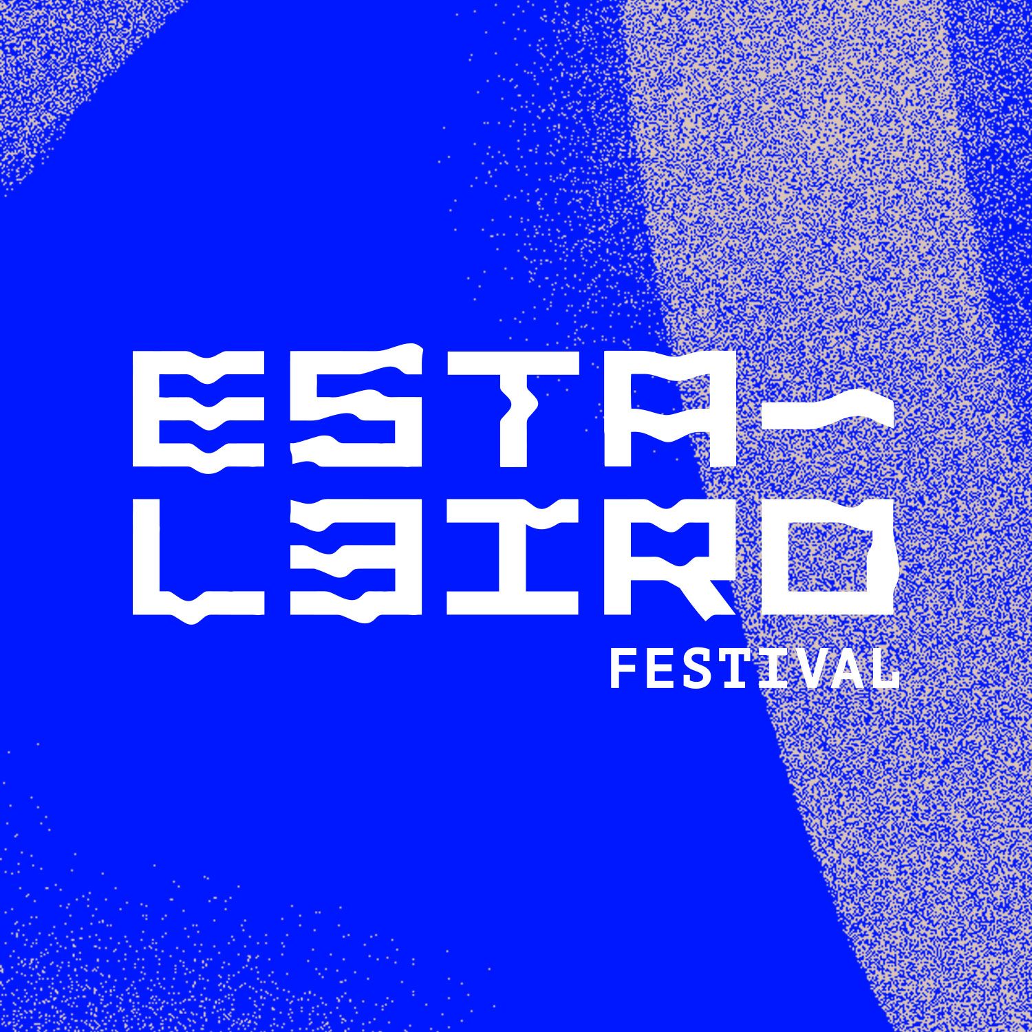
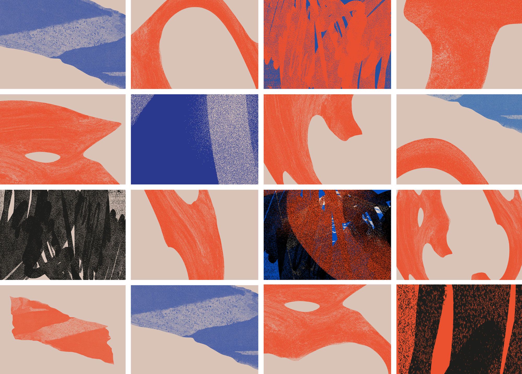
The logo can be explained as a game of distortion and experimentation of the typography, to reflect construction and deconstruction, a reality present in any shipyard. From the metallic and raw colors emerge the unstable textures of mud, wood, soil and water. The mud comes from Cávado's riverbanks near the shipyard; the eroded wood from the place where once were built majestic ships that sailed the seven seas and now rest at the bottom of the river; and the soil and water come from the connection the people from Esposende have with these natural elements. Particularly noteworthy is the fact that these textures were created from dissecting and drying seaweed in a process carried out by Cristiano Campos.