Name
Orquestra Costa Atlântica
Year
2020
Scope
Branding
Description
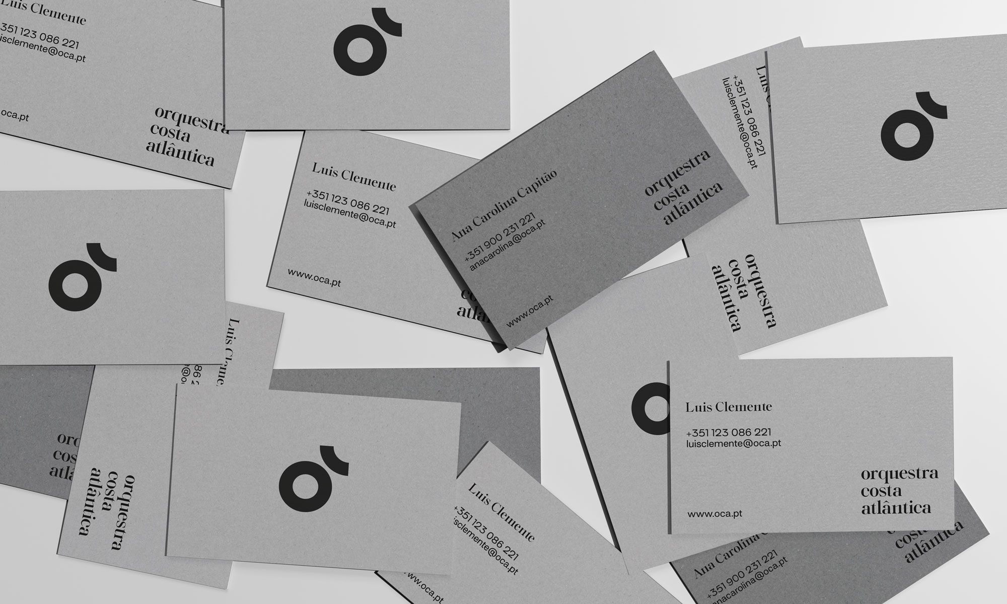
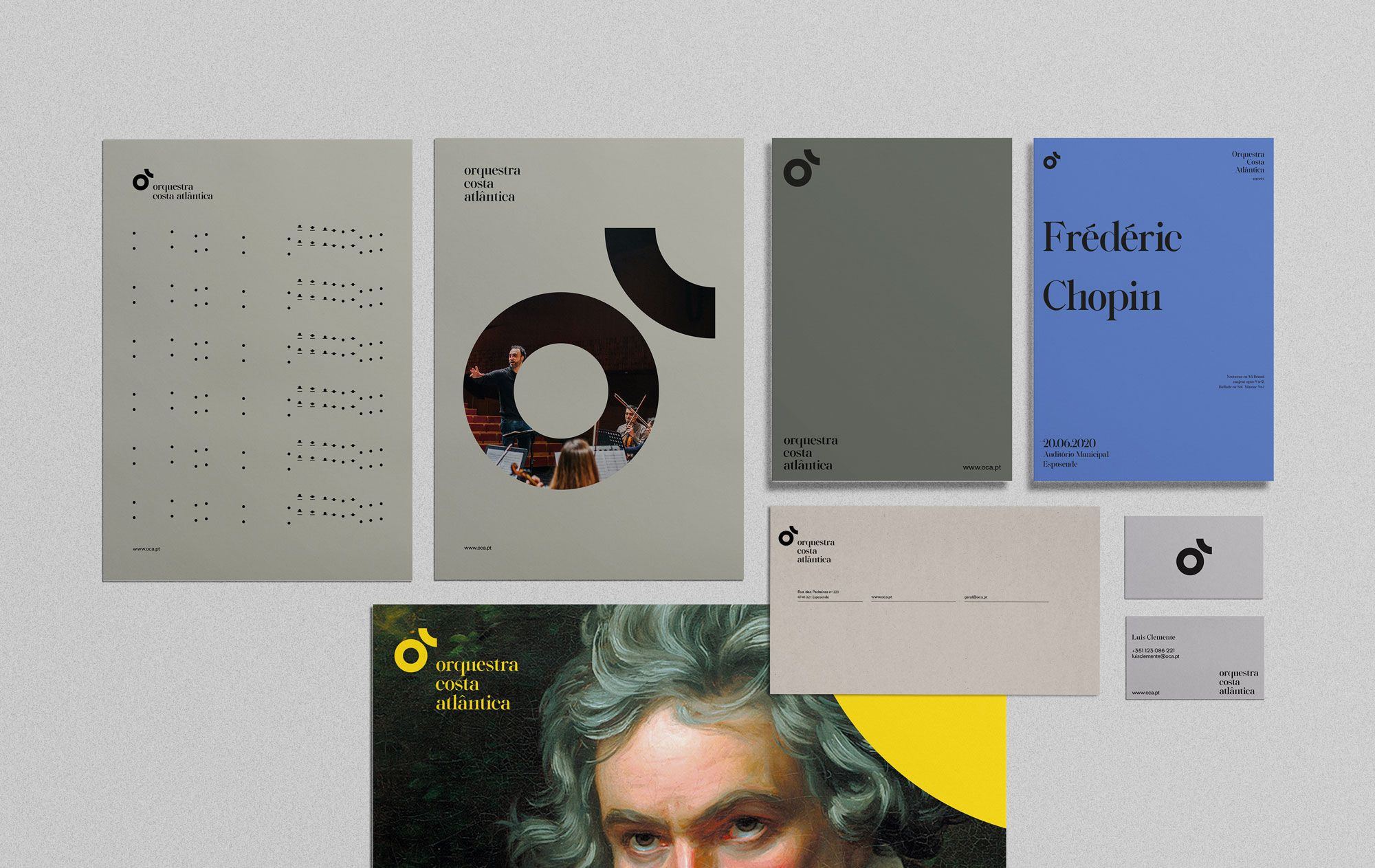
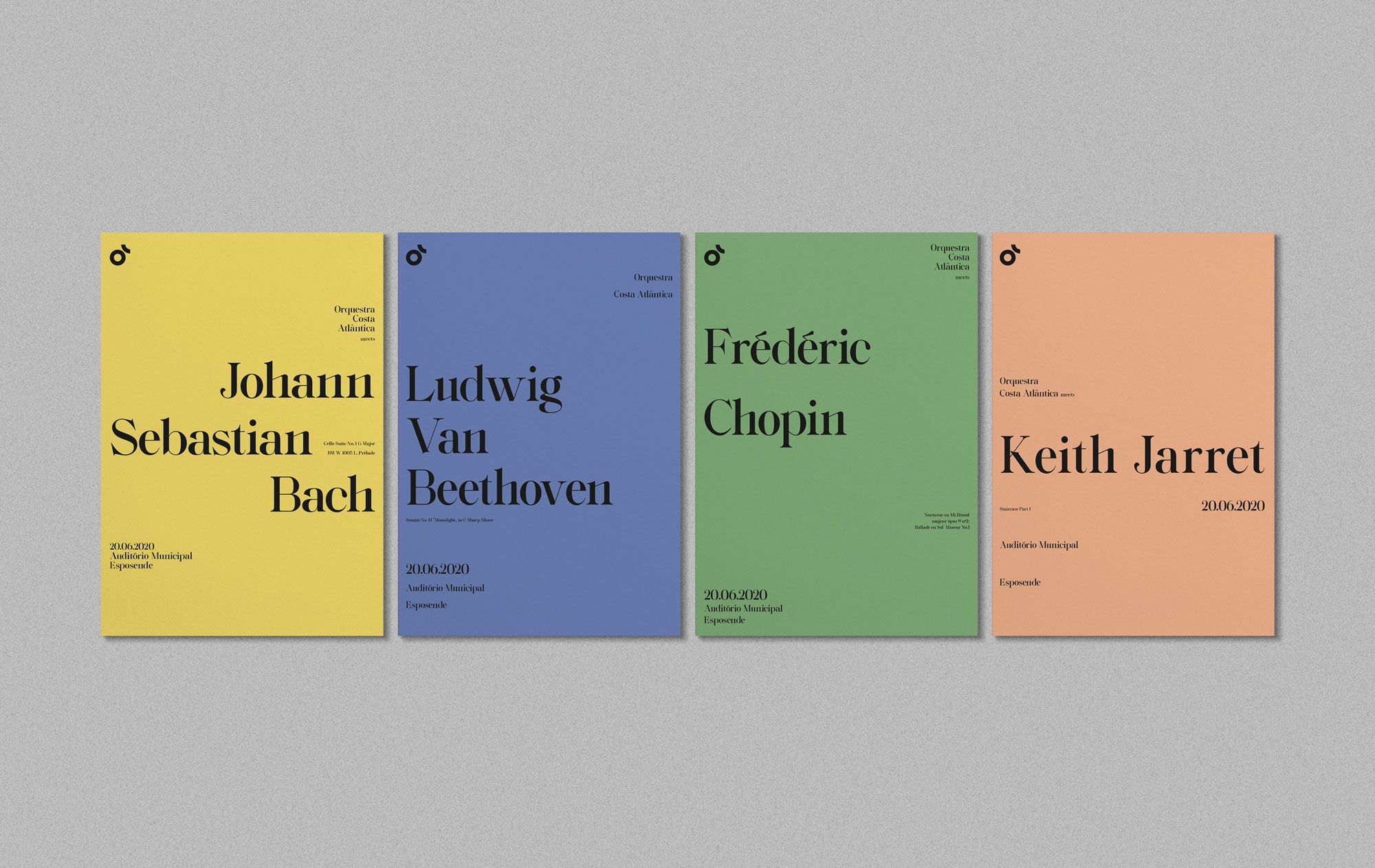
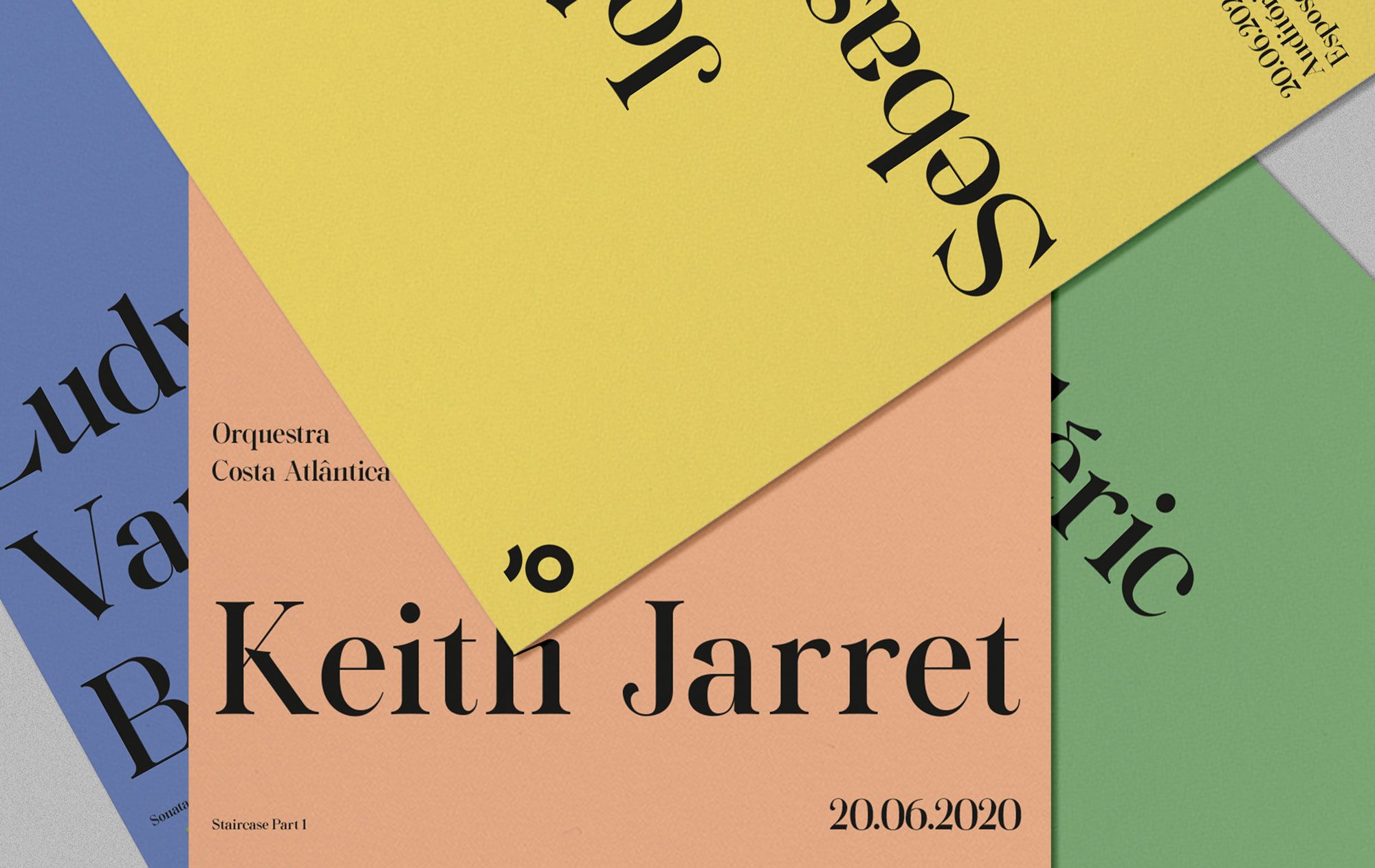
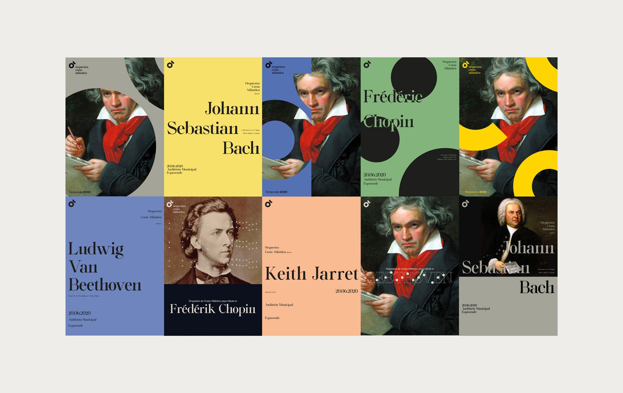
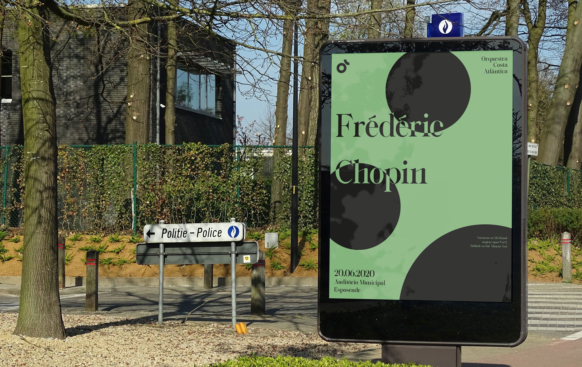
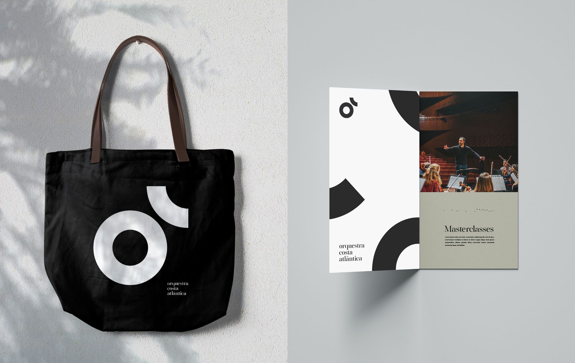
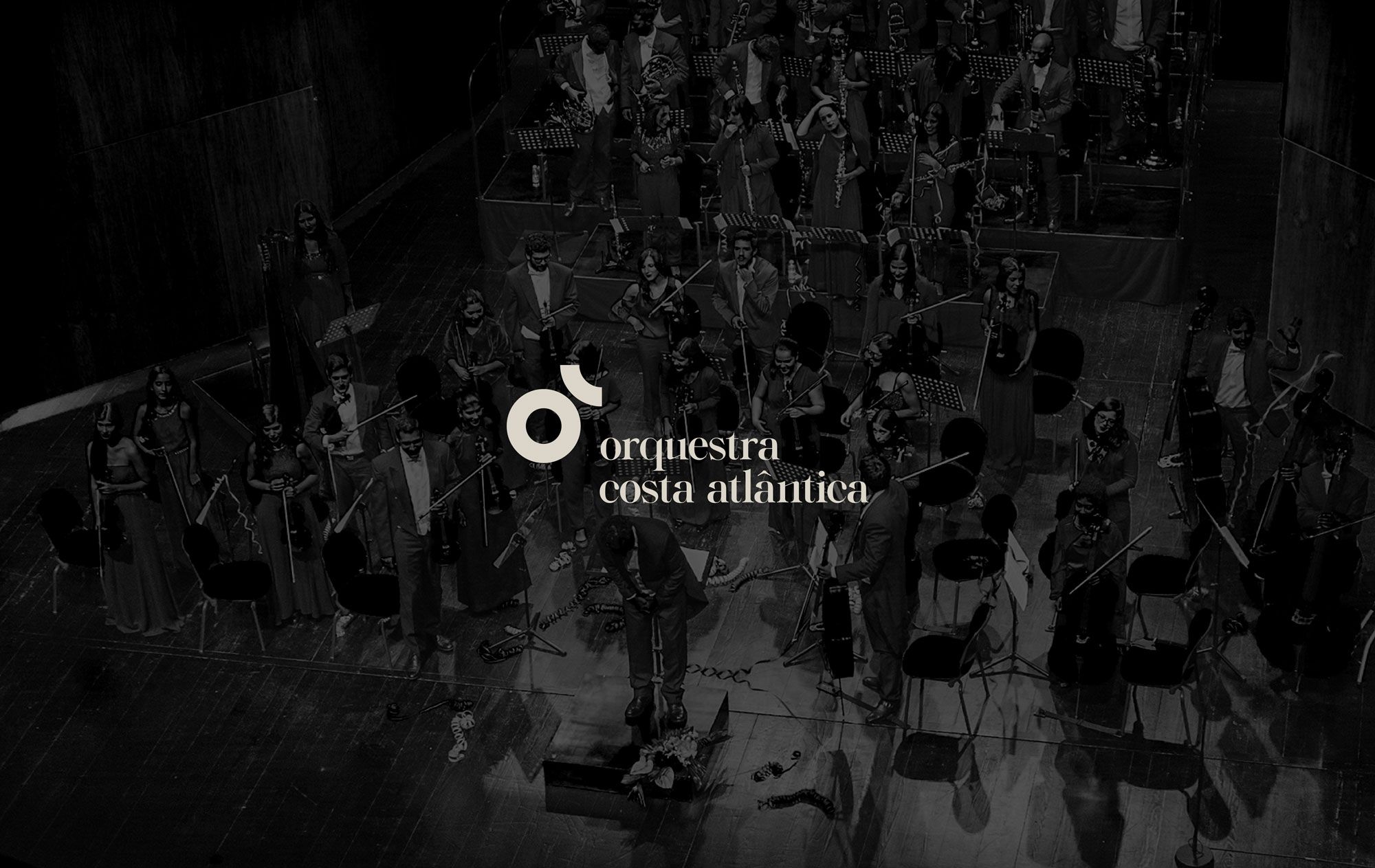
The Orquestra Costa Atlântica is a symphonic musical group that has had a regular program since March 2015, when they first performed in concert. Distinguished as one of the most innovative groups and a reference in the scope of classical music in Portugal, they decided to rebrand their image in 2020.
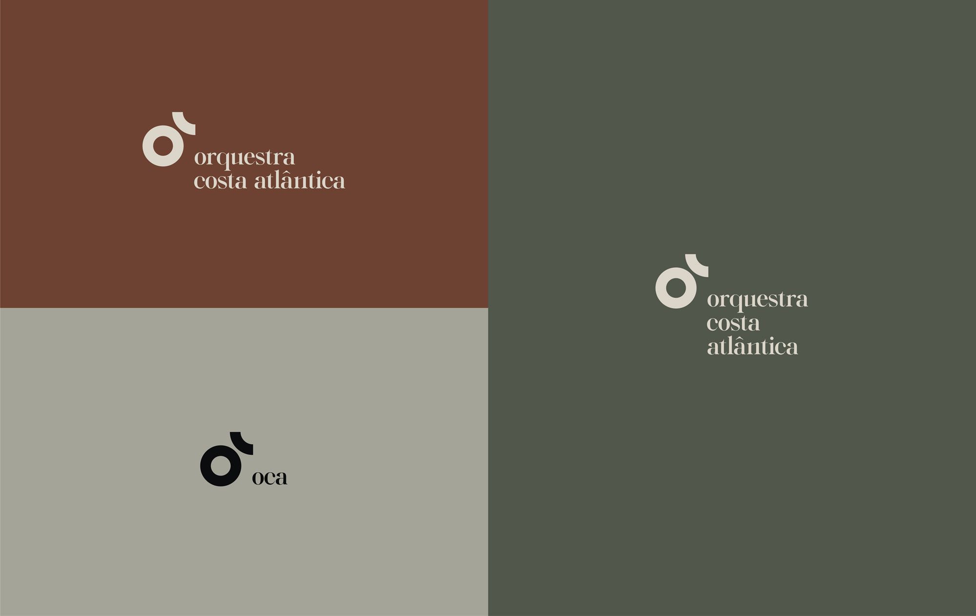

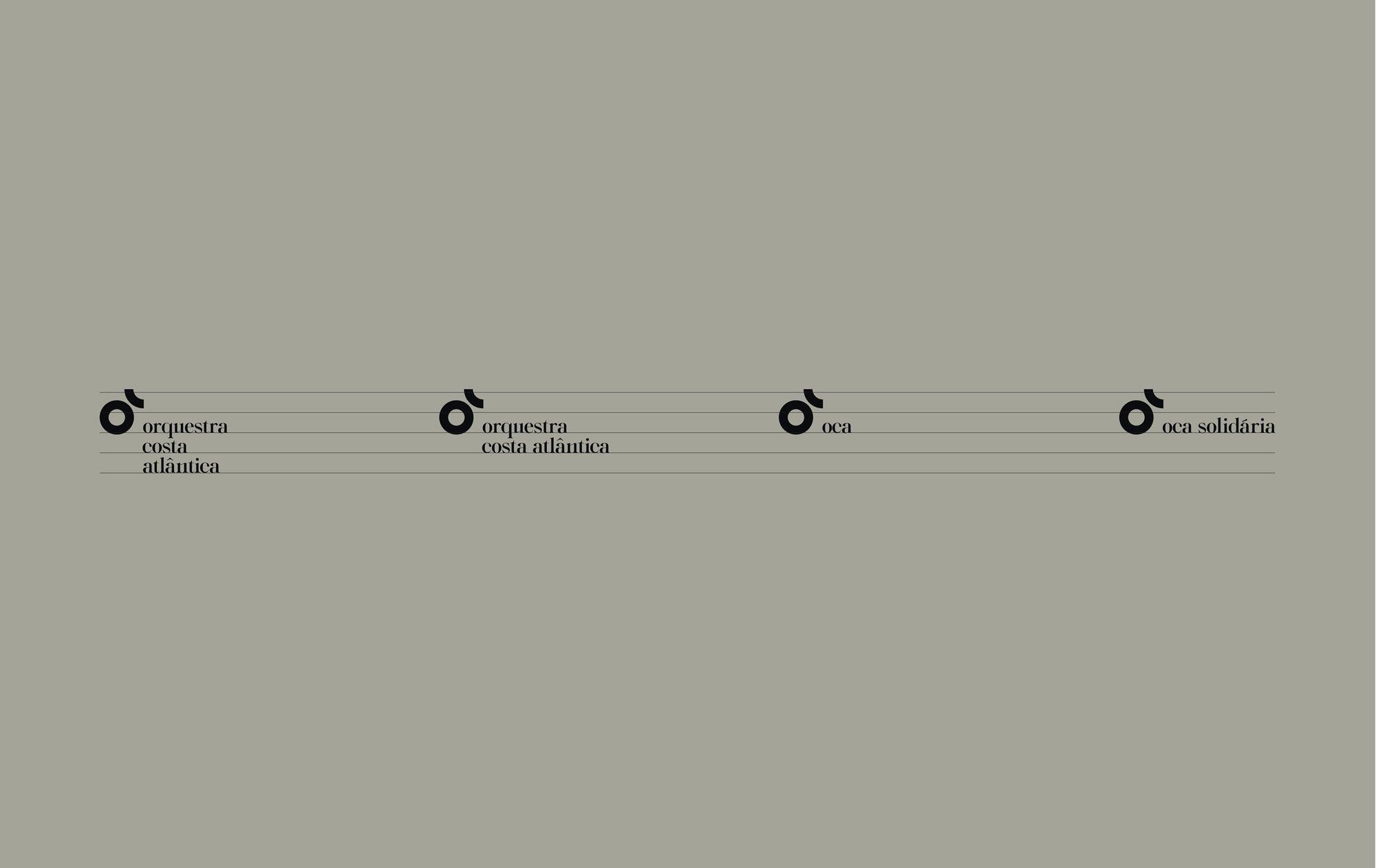
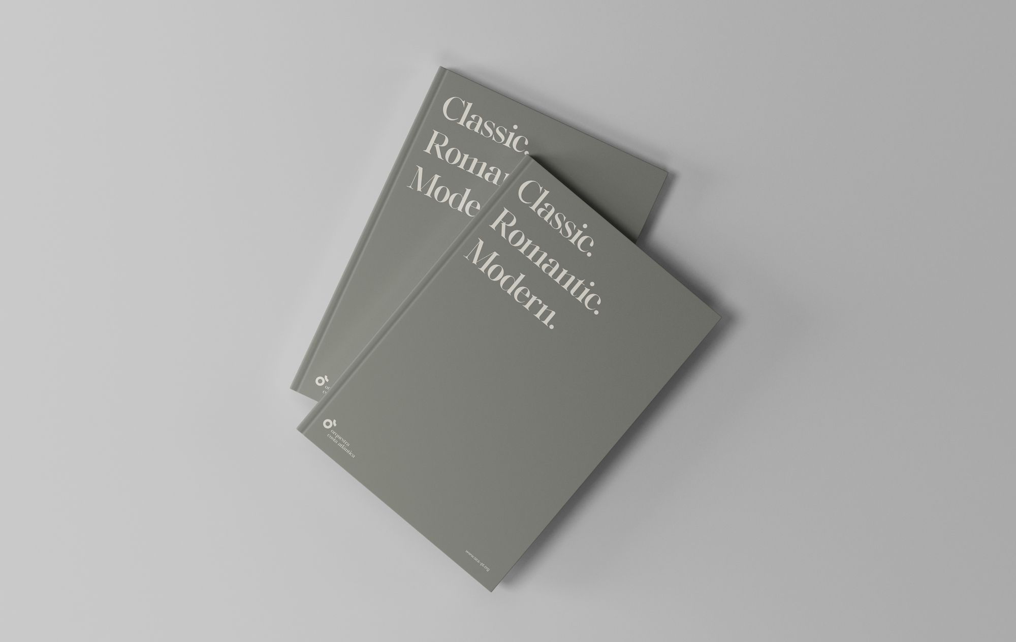
At its essence, the logo represents clefs, eighth notes and noteheads in a simple and abstract form, keeping its meaning and clarity. Since the debut of the rebranding, it was set that the logo should have the same standing in the identity as a clef in a musical score: an indicator of rhythm, pitch and tone of voice, amongst other information. Therefore, if the logo personifies a clef, the communication material -- physical and digital -- could also take inspiration from musical scores and grids. In its turn, the chosen typography revives the three periods of erudite music: classical, romantic, modern.